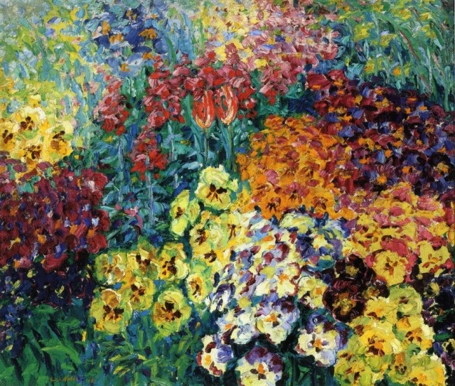
I really admire this piece for the expressionist-like technique and the hues that is presents. The flowers are very easily recognizable, yet they are very whimsical and appear as if they were quickly painting, conveying a lot of emotion from the artist through the technique. The use of repetition in this piece creates a unity, and the colors are calming in a sense through the hue choices (yellows, blues, greens, reds). I like this piece because it is an appreciation of nature since a lot of people do not take the time to stop and appreciate nature for what it is. I also think that this piece pulls together very well through the repetition of the different hues throughout the entire work, which creates a great balance. I also really admire how the warm and the cool hues work against each other, making the piece a bit more interesting. I admire this piece mainly for the technique and the unique depiction of nature.
Image derived from: Emil, Nolde. Flower Garden: Pansies. N.d. Painting. All PaintingsWeb. 9 Dec 2013. <http://www.allpaintings.org/v/Expressionism/Emil Nolde/Emil Nolde - Flower Garden Pansies.jpg.html>.
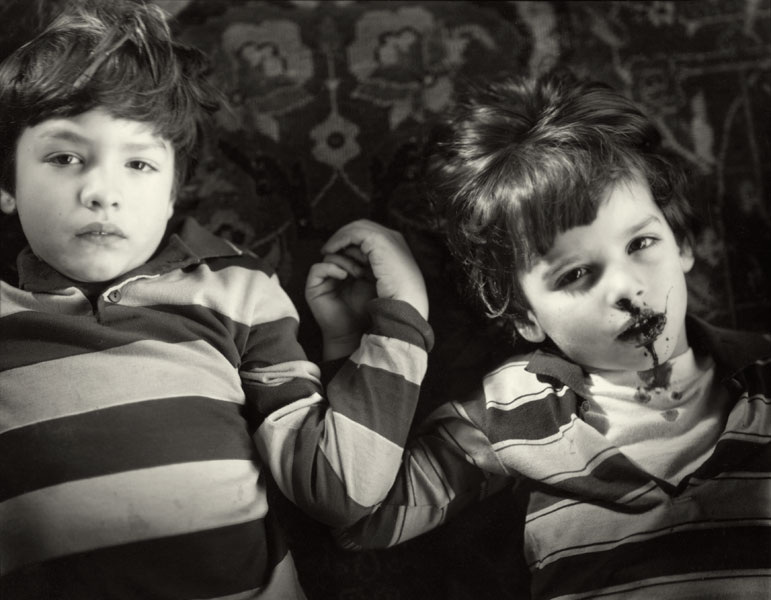
I admire this piece because it is very though-provoking and controversial. It is not something that is commonly seen in art and it provokes a lot of emotion. This piece is very conceptual and when I view this piece I immediately think of a life and death type theme. The black and white also adds onto the theme of death, The subjects are both very similar in appearance, possibly meaning that they are supposed to portray the life and death of one individual and the idea that we all experience life and death. The positioning of the subjects in the piece creates an asymmetrical balance, which also contributes to the idea of life being very unbalanced and that we never know when death will come or near. I also think that is is significant that the subjects are both laying down and embracing hands, because not only do we lay down when death is near, but life and death are both hand and hand (metaphorically speaking). I think this piece is genius and I think it is great because it provokes a lot of emotion and controversy, but the concept of this piece is very clear and well presented.
Image derived from: Mann, Sally. Untitled (Family Pictures Series). 1984-1991. Photograph. Sally MannWeb. 9 Dec 2013. <http://sallymann.com/selected-works/family-pictures>.
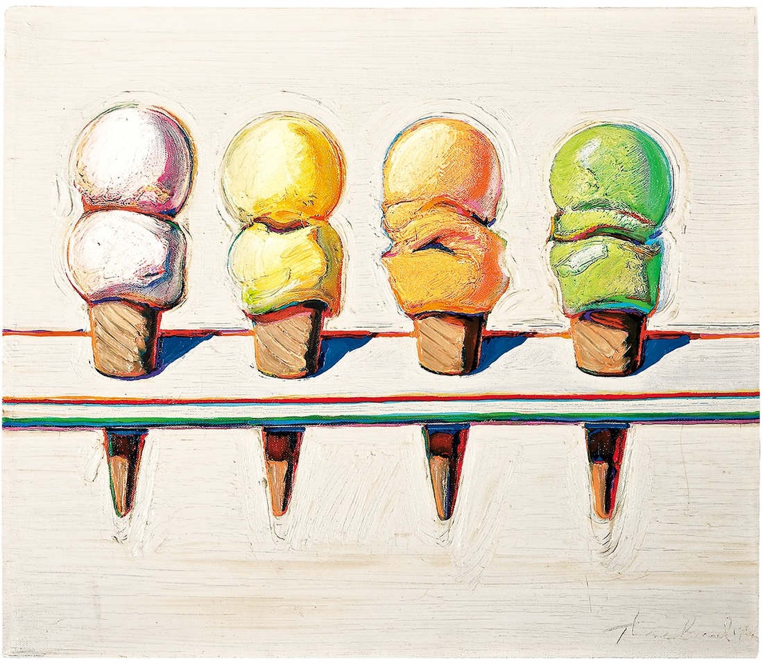
I admire this piece a lot for it's simplicity. Although the piece is very simple and lacks a lot of detail, it is an interesting concept. I like this piece mainly because it is a pop art piece, and it deals with the idea of commonplace objects (the ice cream). The piece is influential because it creates an emphasis on the ice cream and the role that it really plays in our daily lives, we just do not realize it because the item itself is so commonly seen. I also think this piece is significant because it is an example of how objects reflect light. The colors are also very pastel-like, creating more of an uplifting experience for the viewer. The lack of detail in this piece in the background (surrounding the ice cream cones) plays a vital role because it helps create emphasis on the cones. The colors are what really draw me into this piece, because they are all colors that potentially symbolize happiness - which correlates to society and the ice cream. When we are sad or are looking to have a good time, people go out and eat ice cream in order to be happy or have fun with others. Knowing this, the hue choices in correspondence with the subject matter makes sense, and I think that this piece is very successful and I admire it a lot.
Image derived from: Thiebaud, Wayne. Four Ice Cream Cones. 1964. Painting. New YorkerWeb. 9 Dec 2013. <http://www.newyorker.com/online/blogs/culture/2012/11/cover-story-wayne-thiebaud.html>.
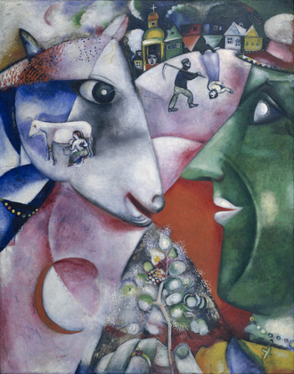
Typically I am drawn to realism and hyper-realism and am opposed to the idea of two-dimensional like work, but I actually admire this piece and think that it is interesting in its own way. I admire this piece a lot because it tells a story in an abstract and cubist-inspired way. The piece is very geometrical and presents a lot of shapes. The hues are very contemporary and add on to the idea of this piece presenting a story. I think that the concept is interesting which I discovered when reading about the piece on the source I found it from. The description of the piece reads "In the village, peasants and animals lived side by side, in a mutual dependence here signified by the line from peasant to cow, connecting their eyes. The peasant's flowering sprig, symbolically a tree of life, is the reward of their partnership. For Hasids, animals were also humanity's link to the universe, and the painting's large circular forms suggest the orbiting sun, moon (in eclipse at the lower left), and earth." The piece itself is an experience from the artist, which I think makes this piece even stronger. In other words, there are no made up characters or a made up theme or story, but there is a real and pure story behind the piece. The piece illustrates the relationship between the animals and the peasants that was created from the fact that they lived side by side. The green hue on the subject of the person illustrates the concept of a peasant very well. The red hue signifies the bonding relationship that has formed between the two. I think this piece was very well thought out and it makes sense. Every detail and every symbol plays a role in this piece, and the hues work together very well.
Image derived from: Chagall, Marc. I and the Village. 1911. Painting. Museum of Modern Art, Chicago, Illinois. Web. 9 Dec 2013. <http://www.moma.org/collection/object.php?object_id=78984>.
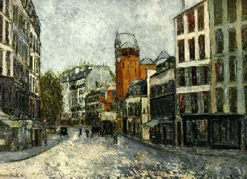
I really admire and appreciate this piece for the concept of impressionism and the emotion that derives from it combined with the concept of the city and the technicality that the city presents. There a juxtapositioning that is occurring in this piece in regards to the two concepts, and I think that is what makes this piece very successful, yet interesting. The city and the idea of drawing a city is very technical in regards to the buildings. The windows in accordance with the actual buildings need to be proportionate, and the viewpoint must make sense in accordance with how the buildings are positioned. The idea of impressionism on the other hand, is very free-forming and emotional. In this piece, Utrilo really uses the technique of the paint brush to create the emotion, and even a texture through the lack of blending the colors. I admire this piece, because I interpret in a way of allowing your surroundings to influence you. In other words, the paint brush strokes and the colors combined with the technique are the emotions that the artist derives from his city or the surroundings, and this concept goes for anyone in general. We feed off of our surroundings and we are influenced and inspired by those who surround us. That is how we are wired, and that is how we are driven and how we move forward in order to succeed. We feed off of the work of others for inspiration - we feed off of the things we see and the people that influence us either directly or indirectly.
Image derived from: Utrillo, Maurice. Rue des Abbesses. 1910. Painting. Rosings, New. Web. 9 Dec 2013. <http://www.rosings.com/abbesses.html>.
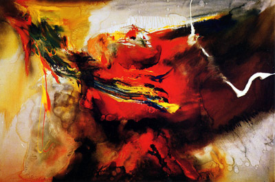
I really admire this piece for the abstraction that it presents. This piece is very similar to my last post, but it is unique in its own way. The colors that are used in this piece are warm-dominant, yet there area few subtle hints of cool colors that appear (green, blue). Although the piece itself is very abstract, the lines are very controlled and delicate. I like this piece a lot, because the piece reminds me of food coloring or water color being mixed in with water. I also love this work because it conveys a lot of emotion, similar to the last post. The color and the technique help to convey the emotion, rather than the subject matter. The most interesting aspect of this piece is the title and what it is potentially conveying with the abstract subject matter. When looking up Osage to see what it means, Osage is a native american tribe,which leads me to believe that the artist is conveying emotions about this native american tribe or the idea that it is a part of them, or that something to do with Osage caused conflict in the life of the artist, or it impacted them in some way. Overall, I really like this piece and I appreciate it for the emotion and technique that it presents.
Image derived from: Jenkins, Paul. Osage. 1956. Painting. Paul Jenkins, The New Orleans Museum of Art. Web. 29 Nov 2013. <http://www.pauljenkins.net/works/pain.html>.
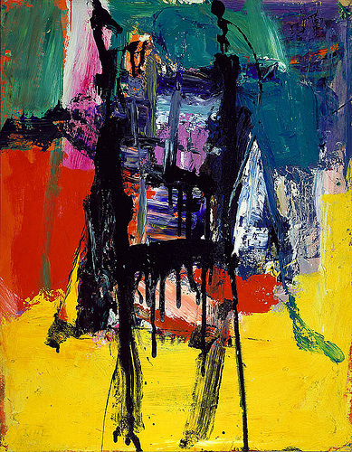
I really admire this piece for its wise use of color in a contemporary fashion. I really like the abstraction that is going on and how the colors work against each other, making the piece interesting. The technique that the piece was painted in also created a two dimensional texture. The main aspect of this piece that I admire deals with the emotions that you feel from the piece when viewing it. The piece itself does not present actual identifiable subject matter, but rather conveys a lot of emotion that the artist felt at the time that the piece was created. I also think that it is really significant how some of the chosen hues seem to have more of an impact that others do, yet the hues balance each other out very well. For example, the yellow hue seems to at first be a bit overpowering, taking up a large portion of the piece, but then the eye moves towards and black, purple, and blue hues in the middle (this section of the piece is a bit smaller), yet it balances out well with the yellow. In other words the hues were carefully chosen and placed/juxtaposed in a meaningful way in order to create an impact on the viewers. I love this piece and abstract work in general, because there is a
Image derived from: Kline, Franz. Untitled. 1959. Painting. Blog SpotWeb. 29 Nov 2013. <http://poulwebb.blogspot.com/2011/05/franz-kline-abstract-expresssionist.html>.
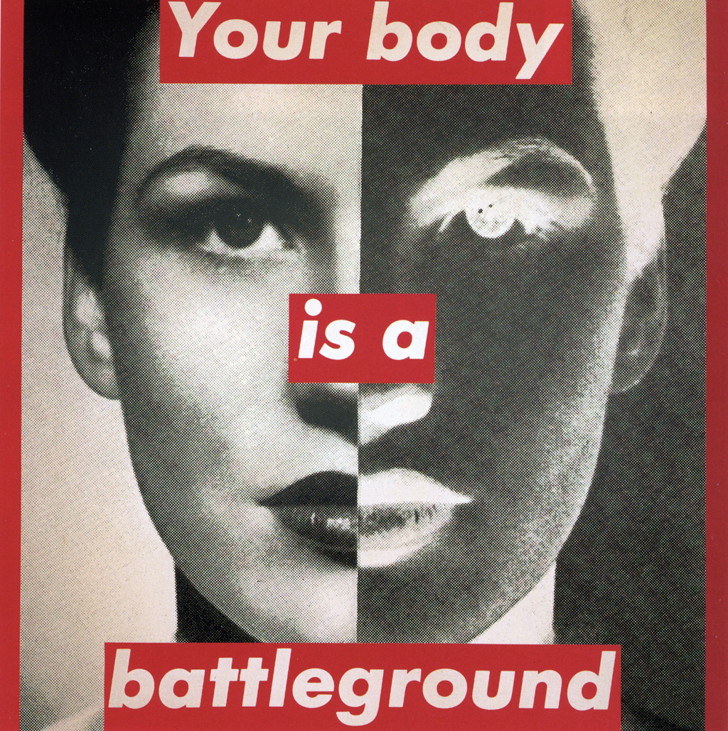
I like this piece a lot and I think that although this piece is dated, it is very inspirational even to women today. I think the concept of this piece is very interesting, and I like the composition and the harsh contrast. I feel that the contrast that this piece presents adds to the darker mood that is being conveyed. The piece is very bold, and the use of the bold, red text also adds on to this feeling of hostility almost. This piece reminds me of an internal vs. external conflict of the inner self. The left side is what we really see on the outside (or what the subject sees of herself), but the right side represents the internal workings or internal being that this woman/subject sees within herself. This piece is very confrontational, and the text is the first thing that I see what I look at it. The concept and message being portrayed is simple, yet it is very powerful. When we think of the internal battle we have with ourselves about our appearance and how we are as human beings, it brings out the worst emotions in us at times, and the red hue chosen with the text really brings this idea up and shines a light on it. I also think that the black and white photographs help effectively convey the theme
Image derived from: Kruger, Barbara. Untitled (your body is a battleground). 1989. photographic silkscreen on vinyl . n.p. Web. 29 Nov 2013. <http://faculty.txwes.edu/csmeller/human-prospect/ProData09/03WW2CulMatrix/WW2PICs/Kruger1945/Kru1989Body400.htm>.
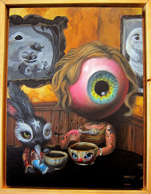
In a sense, this piece reminds me of Alice in Wonderland and the whimsical environment that the movie presents. When I view the large iris as the head, I think of the concept of the third eye and a higher consciousness watching everything that we do. When I look at this piece, my take on it is that the things that we see shape our sentiment towards certain ideals and situations. I think that the star on the forehead of the rabbit is interesting, and when I think of a star I think of reaching to the sky and the idea of the sky NOT being the limit so we can accomplish our true dreams. I get a bit lost when looking at the iris with the idea of the hair making it a bit feminine, and I am not sure how this adds significance to the piece. I also am unsure as to how the tattoo-like qualities of the body of the iris adds meaning to this piece, and if it does at all. The biggest connection I make to the star-like tattoos on the body of the iris-like head are that when we follow and reach to accomplish the goal of pursuing our dreams, our dreams begin to embody us and define who we are as human beings and what we want in life, which could actually be significant in this work. I really admire the surrealist-like qualities of the piece and how it appears to be realistic in a distorted way. The coffee (if that is what it is) also appears to play a significant role in this piece. If you think about modern-day society, many have become dependent on caffeine in order to work harder and harder to accomplish and pursue our dreams and goals.
Image derived from: Brown, Mark. Iris in the Corner. 2010. Painting. FlickrWeb. 25 Nov 2013. <http://www.flickr.com/photos/jeremyriad/4756444314/>.
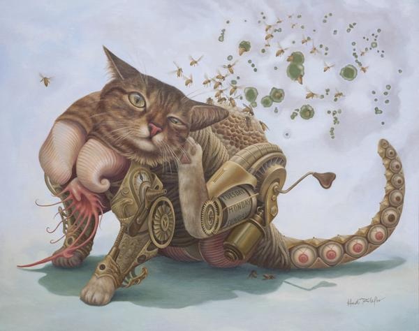
I really love this piece for the concept of surrealism and the uniqueness that it presents through the subject matter. The cat appears to be very mechanical and machine-like, and is conveying movement through the present posture/pose that the subject has been created in. I her explanation where the artist talks about what this series is about (this piece is apart of a whole series), she writes "Originally believing that we shape our own lives, these experiences opened up the possibility that destiny is also an unavoidable aspect of our being." This is significant to this piece, because this makes sense in context with the subject matter and the title of the piece itself. When I think of the cat, the cat (to me) is symbolic of intuition or being intuitive. Cats wander and go places and do things without thinking about what they are doing. Bees symbolize wisdom through the idea that they collect pollen from a differentiation of flowers and turn the pollen into honey (they are smart and understand how to turn one thing into another). From this piece, I take away the idea that the more we work and the the more experiences we endure, the more knowledge we gain, and the more we begin to understand about the world around us and ourselves as individuals and who we are as internal beings. Through our work and things we experience, we do not know and we cannot plan where we will end up in life, but we let destiny guide us and take us there. The visual aspects of this piece are also very intriguing through the idea that they are very realistic yet surreal, which parallels with the idea of life (it is as realistic as it gets). Every external and internal detail is conveyed. The posture of the cat in this piece is also very significant, and I also feels that this adds onto the concept of destiny. Cats typically only scratch their ears if there is infection, which generally is unexpected and is unplanned (infection occurring). I love this piece because it is not only viually appealing, but i
Image derived from: Taillefer, Heidi. Power Hive. 2009. Painting. Heidi Taillefer, New York, New York. Web. 25 Nov 2013. <http://heiditaillefer.com/Power_Hive.html>.
|
 RSS Feed