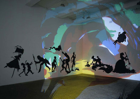
To me, this piece is very inspiring and interesting due to not only the unique usage of medium, but the work of Kara Walker in general is very intriguing because it incorporates history and tells a story. The theme of race is not only incorporated into her work, but there is a specific historical setting. The setting for her works is the pre-Civil War south, which reminds many viewers of the era of slavery. Although Walker incorporates history from that era into her work, it is not always the truth, and she strives to intertwine both fact and fiction into her pieces, allowing viewers to sort out the truth for themselves and self-interpret. I am very admirable of her work for the abstract color used for backdrop scenery (which is created by a projector), because it contrasts greatly with the black silhouettes - which is another aspect that I admire. The identities of the characters she creates in her pieces are not revealed, which allows viewers to create identities for those characters. I admire her work, because it tells and re-creates a story, as well as incorporates actual facts, which is significant to myself, because it allows humanity to ponder upon events of the past and make self-realizations and see how we have progressed as a whole and how we can prevent negative events for re-occurring (for example - slavery).
Image derived from:Walker, Kara. Darkytown Rebellion. 2001. Cut paper and projection on wall. Southern SpacesWeb. 12 Sep 2013. <http://www.southernspaces.org/2008/horrible-beautiful-beast>.
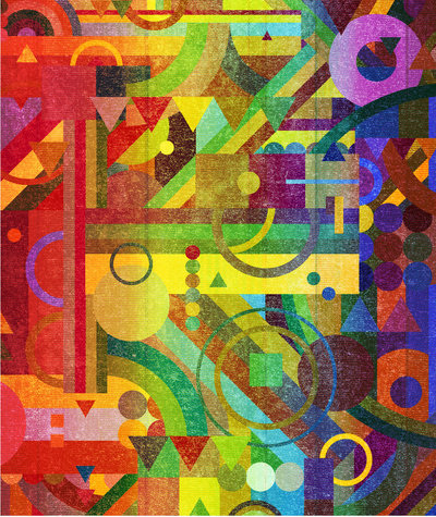
It's the color usage, the shapes, the abstraction, the use of line, the uplifting feeling that I get when I view this piece. I love how there is almost a clash of warm and cool colors, yet they create unity through the way the composition is laid out and through the placement of colors/juxta-positioning of the colors next to one another. There is a modernistic feel, and a sense of energy that comes from the piece. There is an "in your face" kind of feel through the harsh edges of the shapes, and there is visual appeal through the differentiation of line weights, and sizes of shapes. There is a variation of pattern, which to me is phenomenal, because, although there is a large variety of patterns, they are laid out in a way that allows them to unite. In other words, certain elements of certain designs appear all throughout the piece, and certain patterns collide with the other designs, pulling the composition together. I feel that this directly relates to the current digiral project we are working with in adobe illustrator through the concept of working with different line weights, patterns, shape, negative/positive space, etc. The only difference is that we are working in black and white.
Image derived from: Nelson, Nick. Future Patterns. 2012. Digital Composition. WeHeartItWeb. 11 Sep 2013. <http://weheartit.com/entry/29167175/via/scrapps>.
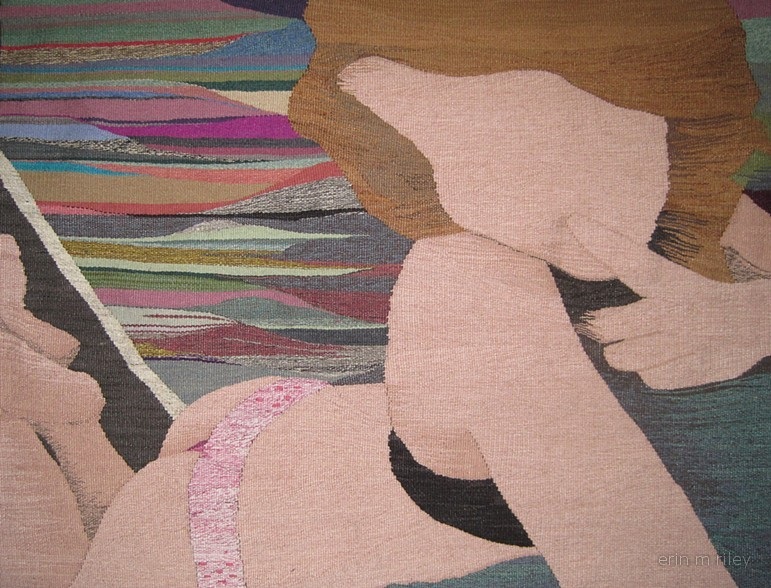
Erin M. Riley is a very contemporary artist who works with wool tapestry, and she is within one of my top ten favorite artists (at this current point in time). I really admire her work for the concepts that she presents, and also through the unique medium that she works with. Riley brings contemporary issues into her work and brings attention to them through not only the content she presents (subject matter), but she uses a medium that fits with her concept, as well as her choice of color usage and the lack of detail. Riley presents subject matter that is commonly seen on the internet, and she presents the actions of teenagers (teenagers sexting, doing drugs, smoking, etc), which brings attention to the issue and gets her viewers to think about why kids of the modernistic age do these things. It gets people thinking about how this issue can change and what we can do to change it, which to me is very inspirational. I also really admire the use of abstractism in her works (for example, in the piece above, the subject is faceless). This is significant and admirable, because it allows the viewers to kind of paint the picture and self-interpret/create their own story. The fact that the subject is faceless is significant as well, because if the subject DID have a face, then the story would already be told. The piece conveys the idea that anyone can choose to pursue the actions and make the choices that these pieces convey. The color usage is also realistic, yet some parts of the work is a bit abstract, which I also admire, because I really love abstract work and try to incorporate that technique into my own work. The choice of medium/wool/fabric is also inspiring, because it fits well with her concepts. The concepts that Riley chooses to present kind of show how life can deteriorate and fall apart when teens/young adults make negative choices. Similar to these, fabric can unravel and fall apart as well.
Image derived from:Riley, Erin. Secrets. 2013. Hand woven wool tapestry. Erin RileyWeb. 10 Sep 2013. <http://erinmriley.com/artwork/3113521_Secrets.html>.
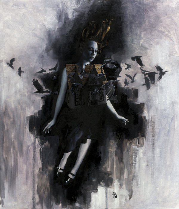
I really admire this piece and everything about it. There is a lot of symbolism and concepts that I get from looking at this piece. From the posture of the subject, the pose gives the illusion that the figure is free-falling. I am in love with the concept of the house that surrounds the subject/the subject is wearing, and it goes hand in hand with the pose of the subject. It is almost as if the piece is portraying the idea that you are where you come from. For example, the environment you grow up in, the people that surround you, the ideals and beliefs you were raised with, mold you into the person you are in your current state (today). The crows that are surrounding/flying out of the house, to me, symbolize that the experience of the subject growing up was negative, and it is as if they are flying outwards to get away from the house, and not go towards it. I also find it very significat that the subject is wearing/appears to be wearing ballet shoes, which make me think of dancing or moving freely. In a way, the piece reminds me of "The Dance of Death" or Danse Macabre. It is almost as if the piece is illustrating the idea of how people live in homes where things are not well and they do not grow up in a great or stable environment, so as life progresses, they begin to spiral downward (free falling), yet they have the choice to contemplate the idea of changing their life for the better and getting out. If positive choices aren't made to better an individuals life, then they continue to spiral downward, even further and further. I love this piece because it is very interpretive and there is a lot of meaning behind the piece.
Image derived from: Stoupakis, David. House of Faded Memories. 203. Painting. David StoupakisWeb. 9 Sep 2013. <http://davidstoupakis.bigcartel.com/product/house-of-faded-memories>.
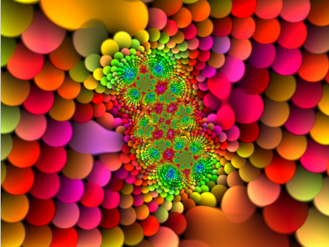
When first viewing this digital piece from a glance, I was very drawn into it by the bright color usage, as well as the concept of depth that is created through the variation of sizes of the circles and their placement (almost as if the circles have been placed in a mathematical way - calculated). In a way, this piece relates to the current "Circle,Square, Triangle" project that we are working on in class. The circles are designed and laid out in a way that almost creates a form, but in a two dimensional way. This piece also differs from the project from the color usage, since in our project we are limited to shades of black, grey and white. Although from the outer edges of the piece, there only appears to be circles, near the middle/center, the circles almost seem to come together to form other shapes. The variation of sizing of the circles creates an illusion, and the sizing (big to small) gives the illusion that there is a never ending tunnel, or vortex - which is also created through the use of repetition of the circles. Beginning from the outer edges and moving inward, although the colors are all of brighter hues, the colors near the edges seem to be shaded, yet as the eye follows the patter inward, the hues become more tinted, and the values of the hues begin to change and brighten. Through the hard edges of the shapes, there is a contrast that acts as a barrier, and allows the viewer to differentiate the shapes. Through the repetition and differentiation of hues, there is a flat texture that is created. I really admire this piece for the illusion and mature color usage (the juxtapositioning of colors was well thought out). I love that idea of taking a simple object and expanding upon the idea of it - creating an entirely new concept. I also like the concept of being infinite in this piece, which is created by the illusion of the "never ending tunnel".
Image derived from: Klein, Albert. ABSTRACT MULTI-COLOURED FRACTAL DESIGN. N.d. Digital Design. Art.comWeb. 9 Sep 2013. <http://www.art.com/products/p13800577-sa-i2760505/albert-klein-abstract-multi-coloured-fractal-design.htm?aff=conf&ctid=1902187184&rfid=765881&tkid=15070171>.
Danny O'Conner is one of the most influential artists on me that I have encountered by far and he had huge influence over my work that I created in high school. O'Conner not only works with paints, but he is really diverse with his media and he does a lot of digital work, street art, paintings, etc. I am very inspired by O'Conner's work not only for his ability to work diversely with different mediums, but also for his contemporary portraiture and his ability to work in layers as well as convey emotions in his pieces. For example, I am very drawn to the piece above because it is as if the figure is being overtaken by their thoughts/emotions. The piece illustrates the idea of an individual contemplating a situation or experience that is occurring in their life, and the piece seems to be representational of the idea of an individual coming to a realization about that situation, and it's as if once that realization occurs, the pieces begin to fit together again and life begins to make sense. I really admire how each of the different elements presented through the layering pull together to create a feel of unity, which correlates with the meaning behind the piece that I pull out of it (realization/pieces fitting together). The choices and placement of the different hues also play a significant role in the piece, and almost seem to present the clash between the struggle of realization and the accomplishment of overcoming the realization.
Image derived from:O'Conner, Danny. Rupturing Contemplation, Amidst Lucidity. 2012. Digital Piece. FlickrWeb. 6 Sep 2013. <http://www.flickr.com/photos/artbydoc/8144553564/>.
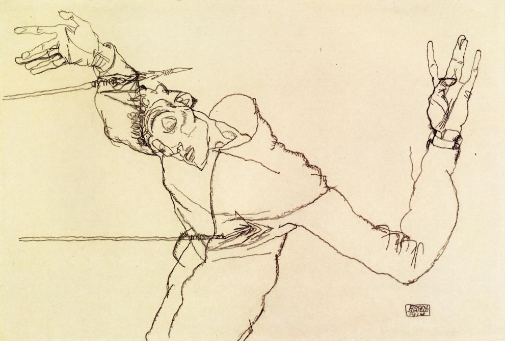
I have always been and will always be very inspired by the work of Egon Schiele. Although I love very complex work and I am drawn to paintings, I am very connected to Schiele's charcoal sketches for many various reasons. His sketches are very simplistic in regards to excessive detail (there is no deep intricacy in the design, no color usage, no texture to fill in the spaces, no value, etc. The only elements that truly are present in the work are line, shape and space. When viewing this sketch, it is not the intricacy and detail that is the center of attention, but the form and how the lines are used to emphasize the form of the figure. Through lack of color and superior detail, the form of the figure becomes the main focus. Another interesting aspect about this piece itself it the title and the fact that Schiele chose to portray himself as St. Sebastian. In a nutshell, St. Sebastian was condemned to death and shot by his fellow soldiers with arrows for his belief in Jesus Christ. There could be complex reasoning regarding why Schiele chose to do this, but it is an interesting and abnormal (to me) concept of a self-portrait. Many self-portraits that are seen are traditional, or modernistic, with a typical front-face style portraiture. This piece is a bit darker, with the expression of the figure (Schiele) being emphasized through the form of the arms, and the arrows. The fine lines really draw me into the form and allow me to almost try to picture myself being in the same position as the character. Very intriguing.
Image derived from:Schiele, Egon. Self Portrait as St. Sebastian. 1915. Charcoal Drawing. Egon Schiele (The Works)Web. 5 Sep 2013. <http://www.egon-schiele.net/Self-Portrait-As-St--Sebastian.html>.
Knowledgeable information obtained from: Sisters of Notre Dame, . "Saints Fabian and Sebastian."Loyola Press. (2009): n. page. Print. <http://www.loyolapress.com/saints-stories-for-kids.htm?cId=402584>.
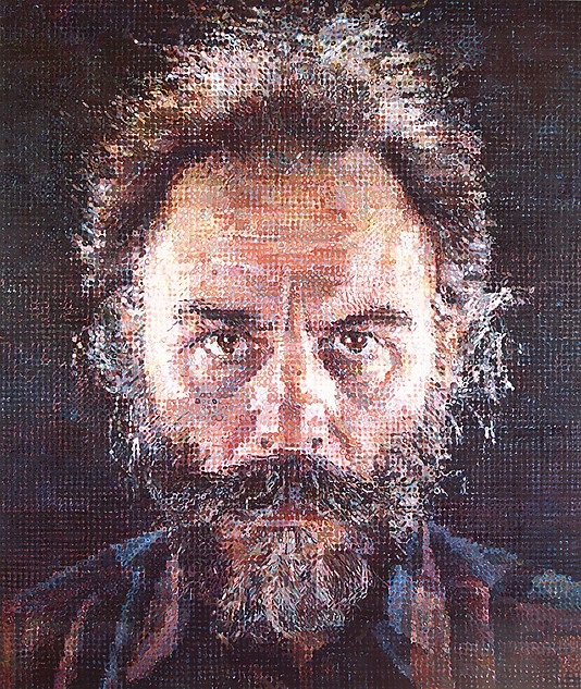
One of the most influential artists of all time and one of my biggest inspirations - Chuck Close. In hi piece above (Lucas I), there is such a complexity to the piece, yet it is simple and the elements unite together to create one large portrait. The amount of detail, the intricacy, the wide variety of color usage, the usage of shapes, and abstraction - all in one, are what draw me to Close's work. I love that with his stippling technique, Close challenges traditional portraiture and transforms the concept of traditional portraiture completely. In a sense, this piece reminds me of the current "Circle, Square, Triangle" project that we are working on in class. For the project, we are to create complex designs out of circles, squares, and triangles, and experiment/learn to understand composition, line weights, choice of color usage. In other words, to create a successful and complex design, it is key to understand the geometrical shapes and how they can work together to create a powerful geometric composition, and yet create a complexity to it that intensifies the meaning.
Image derived from:Chuck, Close. Lucas I. 1986-87. Painting. The Metropolitan Museum of Art, New York, New York. Web. 5 Sep 2013. <http://www.metmuseum.org/Collections/search-the-collections/484760>.
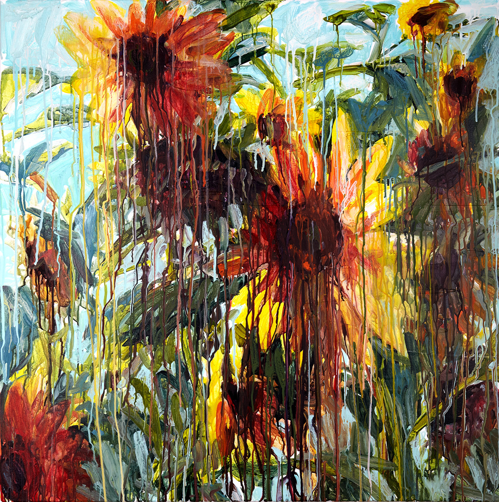
The painting pictured above is very inspirational to myself and connects very closely to my own interests and personal taste in artistic technique. I love the concept of taking a simple image or symbol and distorting it - adding more meaning to the piece and potentially giving viewers more to think about when viewing the piece itself. Particularly in this piece, the color usage is very modern, yet in an almost clashing traditional vs. non-traditional way. For example, traditional colors are used in the flowers (the pedals of the sunflower are yellow, the stem is green, the center is brown, etc) - yet, the technique and overlapping of the paint drips is very non-traditional and modernistic. The paint drips add a lot of character to the painting. It appears almost as if the flowers are melting, or as if the colors from the flowers are dripping off - like ice cream melting in the sun. The color usage is very rainbow like, yet the choice of color usage appears to be very well though out. The abstraction of the piece is what really draws me in, and I love that the artist chose to challenge traditional art by taking something old and making it new (in other words, taking a traditional painting of flowers and making it more modernistic). Yet what is the purpose of the technique? When we think of flowers, we think of happiness, and beauty. The flowers are almost a reminder that all good things can turn bad. A quote that I feel almost connects to this piece, as Confucius once said, "All good things are difficult to achieve; and bad things are very easy to get." In other words, even good people can be easily influenced by negative things and slowly fall apart - and this piece reminds me of that concept. This is also very inspiring to me, because the concept and techniques are similar to my personal techniques that I gravitate towards using in my own work.
Image derived from:
Angliker, Chrissy. Wild Sunflowers. 2012. Painting. Chrissy AnglikerWeb. 5 Sep 2013. <http://www.chrissy.ch/Solo2012/Wild_Sunflowers_web.jpg>.
Quote derived from:
"9 Powerful Life Lessons from Confucius." Pick the Brain. (2010): n. page. Web. 5 Sep. 2013. <http://www.pickthebrain.com/blog/author/mrselfdevelopment/>.
|
 RSS Feed