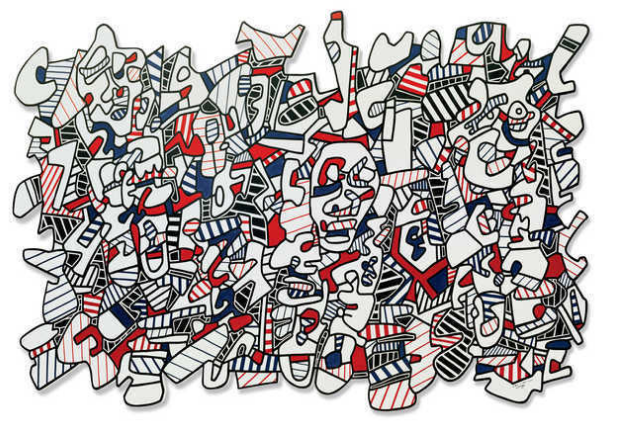
I really admire the work of Dubuffet, because it is very contemporary and abstract, and it strays away from the "norms" that are often seen in art (portraiture, traditional portraiture, traditional sketches, etc). His work is very free and almost child-like in a way (through the lines, lack of color - the idea of coloring in shapes.. this is very similar to the concept of a child and their coloring book). The piece itself presents a feeling of unity through the repetition of the different elements that are incorporated (repetition of the lines, repetition of similar patterns, placement of the hues throughout the piece). Viewers see similar elements throughout the entire piece, which gives off a feeling of unity and balance. I also think it is interesting that the red and blue hues were chosen to be used in this piece. The choice of hues clash against each other. The red hue is warm, while the blue hue is cool, creating a high contrast within the piece. The piece itself reminds me of street art or graffiti in a way. I really admire the work of Dubuffet, because he makes you think about what beauty really
Image derived from: Dubuffet, Jean. Site avec trois personages(Landscape with Three Personages). 1974. Vinyl paint on cut-out pressed wood. ArtsyWeb. 14 Nov 2013. <http://artsy.net/artwork/jean-dubuffet-site-avec-trois-personages-landscape-with-three-personages>.
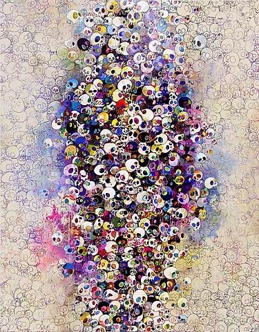
I really admire and appreciate this piece for it's uniqueness. I feel that this piece is very contemporary, yet it has a cultural aspect/twist to it (Japanese). I like this piece because there is a type of juxtaposition that is occurring and in a sense it is almost contradictory in a way. When we think of skulls, we think of death and darkness, but the skulls are juxtaposed with brighter colors. When we think of brighter colors, we think about happiness an the brighter aspects of life. To me, this piece is conveying the idea of not being afraid of death, and embracing it or at least learning how to do so. I really admire the different elements and principles presented in this piece as well, and I feel that they work really well together to create a great composition. The repetition of the skull (symbol) is crucial to creating a sense of unity. The emphasis on the skulls in the center of the piece itself also creates a focal point. The idea of repetition used in this piece also emphasizes the idea that death is never-ending, and it is constantly endured in the world. I also think it is significant that the colors used in this piece (the water color-like hues) are faded, because eventually in reality everything will die off and people and things fade away. I really like this piece, and I think it is different, but I think it works very well.
Image derived from: Murakami, Takashi. Who's Afraid of Red, Yellow, Blue and Death. 2010. Painting. Gagosian GalleryWeb. 14 Nov 2013. <http://www.gagosian.com/artists/takashi-murakami/selected-works>.
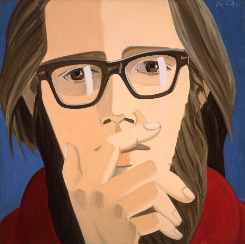
I really admire this piece for the concept of portraiture, as well as the technique and pose presented in the piece. I really like this portrait, because it captures emotion in a unique way. The style to me is very significant to the piece. The portrait itself shows all of the detail that a portrait should (lens reflections, shading to give the piece a bit of depth, etc.), yet the style of the piece itself is still a bit flat (shading is present, yet there is lack of detail.). I admire this technique and style combined with the pose of the figure, because I feel that the lack of having too much detail creates an emphasis on the pose and the emotion that the subject itself is portraying, which I feel is very significant to the success of this piece. I also think that the blue hue chosen for the background combined with the red conveys emotions of anger and sadness - which works very well with the expression of the subject. Typically when we think of individuals who are upset or angry, they tend to cover their faces in frustration or because of sadness. I really admire this piece and I think the portrait itself is great.
Image derived from: Katz, Alex. Ted Berrigan. 1967. Painting. Art ObservedWeb. 14 Nov 2013. <http://artobserved.com/2010/01/go-see-kleve-germany-a-forty-work-retrospective-of-the-alex-katz-at-museum-kurhaus-kleve-through-feb-21-2010/>.
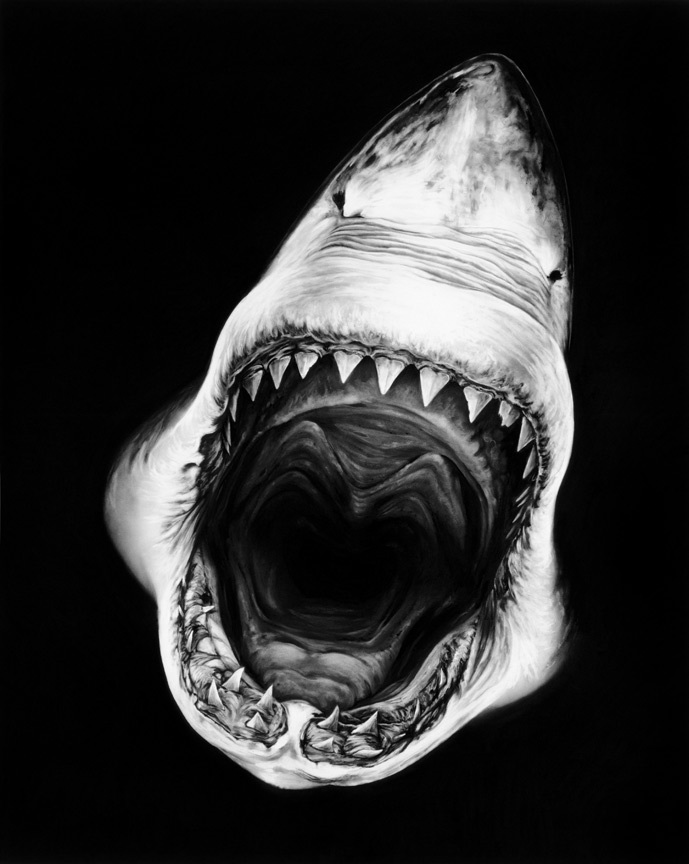
I really like and admire this piece A LOT, and I feel that it is not only very different from a lot of the other works that I have been looking at and blogging about lately, but it is VERY original and unique to the artist. I think the use of charcoal in this piece is outstanding, because a lot of the time when artist use charcoal in their pieces, you can visibly see and tell that it is charcoal that is used through the texture that the medium creates. In this piece, you cannot tell that the sketch was made from charcoal at ALL, and it looks very surreal and realistic. I also really like the choice of the angle of the shark that was chosen in this piece, because not only are viewers exposed to a lot of the inner details of the shark, but it gives the illusion of a black abyss that does not end...almost as if one is swallowed by the shark and continuously falling deeper and deeper into the shark. I am usually drawn to works that use a lot of color and abstraction, but this work in particular really stands out to me. The use of black and white is also VERY effective, and the shading created through the charcoal is outstanding. All of the slightest details are visible, which makes the piece itself more appealing, especially with such a unique angle of the shark - the details are critical in understanding what the subject matter is and conveying this in an effective and efficient way.
Image derived from: Longo, Robert. Shark Charcoal Drawings. N.d. Drawing. My Modern Met. Web. 12 Nov 2013. <http://www.mymodernmet.com/profiles/blogs/hyper-realistic-charcoal-shark-drawings>.
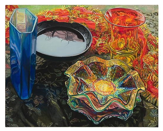
I really admire fishes work for her whimsical use of color combined with the idea of still life images. Interestingly enough, I thought that when I was first viewing her work, and then I went on to actually read her artist biography, which states " A Janet Fish painting is a celebration of light and color that continually delights the eye and engages the mind. Fish invigorates the still life form, both by the energetic way she paints and the often witty and ironic combinations of objects that she depicts". I think that her color usage combined with the traditional idea of still life is very inspirational because it puts a new twist on an old practice or theory. The hues that she incorporates into her work are very eye-catching, yet they work together very well. Her main focus is also on light and how the objects portray the light. The use of detail in this piece also really is significant and catches my eye, because the smallest and slightest details are what separate Fish's still life paintings from those still life paintings that other artists create. She captures every single detail presented in the fabrics, and on the objects, which gives it a very 3-dimensional experience on the 2-dimensional surface. The use of contrast between hues in this piece also makes is very successful, because the objects are easily interpreted. I this piece in particular, because even though the piece presents simple every day objects (still life) there is an energy that viewers feel through the excellent usage of hue, extravagant detail, juxtapositioning of the objects, as well as the use of asymmetrical balance (this creates a unity - there is not an overwhelming feel of the piece with all of the detail. In other words, the placement of the objects and balance creates a more at e
Image derived from: Fish, Janet. Black Bowl Red Scarf. 2007. Painting. Dc Moore Gallery. Web. 11 Nov 2013. <http://www.dcmooregallery.com/artists/janet-fish>.
Quote derived from: Fish, Janet. "Artist Biography." Dc Moore Gallery. n. page. Print. <http://www.dcmooregallery.com/artists/janet-fish>.
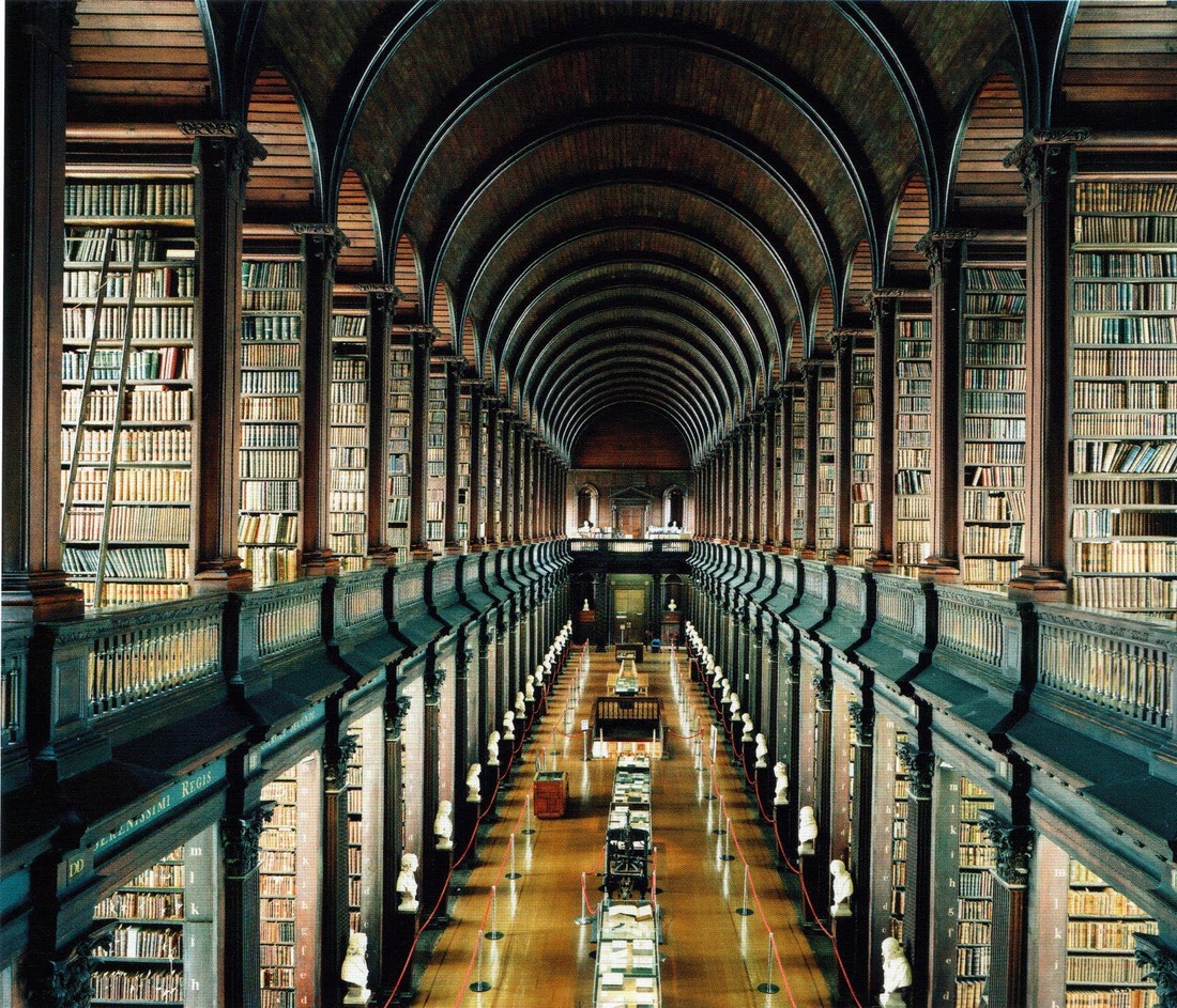
Typically I am more lenient towards paintings and drawings, but I really like the work of Candida Hofer and her photography. She does a really amazing job at taking the idea of creating traditional landscape portraits, yet she does this is a clever way through the angles she presents in her works. For example, in the piece above, the angle is traditional, yet it captures all of the different elements of the library in one shot (the shot captures both sides of the library, the center hallway of the library, the shelves on both floors, the rounded ceiling, etc). Looking at the photograph in a more analitical way, I really admire the great use of balance here. I feel that the angle combined with the intent of balance, as well as the depth of the actual library is what really makes this photograph a successful piece. The piece is also very sharp, so all of the smaller details are clearly visible, which makes the piece beautiful, and is also what the photographer was aiming to capture. I also feel that the colors really make this piece successful. If the image was edited, the colors are not overbearing, and similar tones are found throughout the piece, which makes the image visibly appeasing.
Höfer, Candida. Beautiful Libraries. N.d. Photograph. Web OdysseumWeb. 8 Nov 2013. <http://webodysseum.com/art/beautiful-librairies-by-candida-hofer/>.
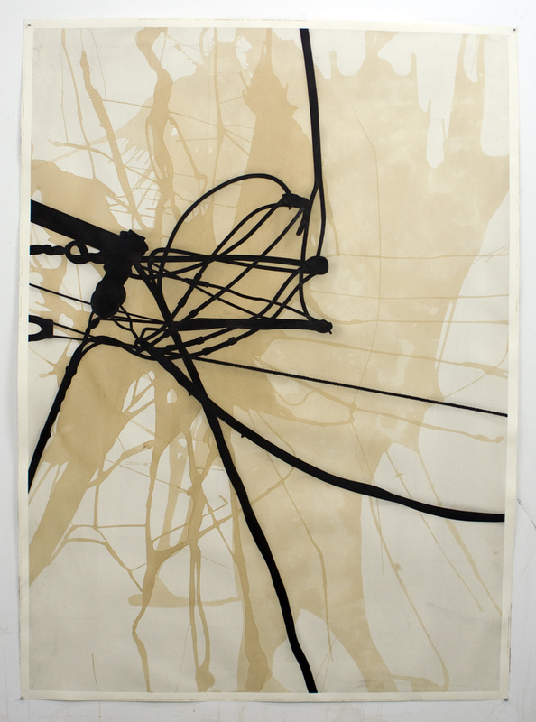
I really love this piece for a few different reasons. I love the abstract feel of the piece, and I also love the unique choice of medium (coffee and ink - who knew?) One of the biggest aspects of this piece that I notice is the fact that there is a well thought out use of balance. The lines creates from the coffee and the lines created by the ink balance each other out very well (even though the piece presents asymmetrical balance). I also think this piece is very successful and works very well because the lines present great craftsmanship. The lines are very precise and present a great quality to them. I also really admire the use of contrast in this piece, and the black lines really pop out from the lines created by the coffee, and it makes the work almost three-dimensional on a flat surface. The lines have a mechanical feel, as if they are wires or even cords. Another aspect of this piece that I admire is that it is not as contemporary as it could be. In other words, the abstract style itself makes the piece contemporary, yet the color usage is not. I think this is great because so many modern artists try really hard to make their works very contemporary through "explosions" of a wide variation of hues (many colors on one piece), but this piece strays away from that idea. Overall, I think this piece is great, and the main aspects of it that I love are the abstract style combined with the Image derived from: Twaddle, Randy. Napa Lines. 2013. coffee, ink on paper. Randy TwaddleWeb. 7 Nov 2013. <http://www.randytwaddle.com/#/alps/>
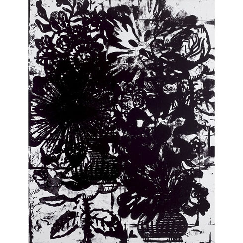
I love this composition and I think for the lack of color, the design is very intricate and is very detailed - which I think is great. The piece itself is very abstract yet is has a direct focus on line weights and how the black and white is used to fill the space and create the design. The style of the piece itself is very block-print like and very solid, which makes the style a bit contemporary, yet in a way it seems to be vintage at a glance through the idea of floral design and lack of contemporary use of color. I admire the work of Wool, because he takes the concept of lines and pushes it to a completely new level. He considers line weights, balance (how it affects the composition as a whole), the usage of shape, I also find it really significant that the pieces he creates are larger, which allows him to create a more meaningful impact on the viewers. I think the high contrast in the piece (through lack of color) is also significant to its success, because it creates an emphasis on the lines and the design, forcing viewers to focus on that. I think this piece is very successful and I really admire the piece not only for its contemporary style, but for the focus and emphasis on the usage of lines (a simple concept - yet it is expanded into a huge, complex composition), as well as the idea of using a simple symbol (flowers) and combining them with the use of the simple technique.
Image derived from: Wool, Christopher. Untitled.. 1993. Enamel on aluminum. Christopher WoolWeb. 6 Nov 2013. <http://wool735.com/cw/images/?iNum=162>.
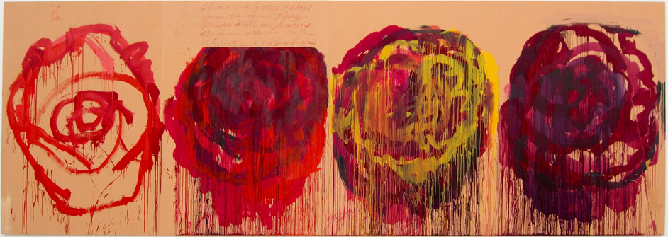
I think this series is great and I draw a lot of admiration from it through the idea of color experimentation, as well as the idea of the series of roses combined with the abstract technique. There is an analogic color scheme going on in this piece, which means that the artist carefully picked out the colors. I think the color scheme works very well, and in a way the hues complement each other. I also like the concept of the paint dripping from the roses - almost as if the color is fading or coming off of the rose itself. I like this piece, because it is more like a sketch and a process piece, rather than a full completed work. It shows how the artist planned out the sketch (the first flower) and planned how they were going to go about created the flowers, and then the artist dove in and experimented with the colors and technique. This idea of experimentation is huge because it is applicable to all art and all artists. I also think it is interesting that the artist chose to paint the wood a lighter pink hue ( that is what the flowers are painted on). I think the pink hue is significant because it creates a high contrast with the flowers, yet it works well with the red and purple hues. I mainly like this piece because it shows the mental process of the artist and the experimentation of that artist.
Image derived from: Twombly, Cy. Untitled (Roses) Gaetac. 2008. Painting. Cy TwomblyWeb. 5 Nov 2013. <http://www.cytwombly.info/twombly_gallery.htm>.
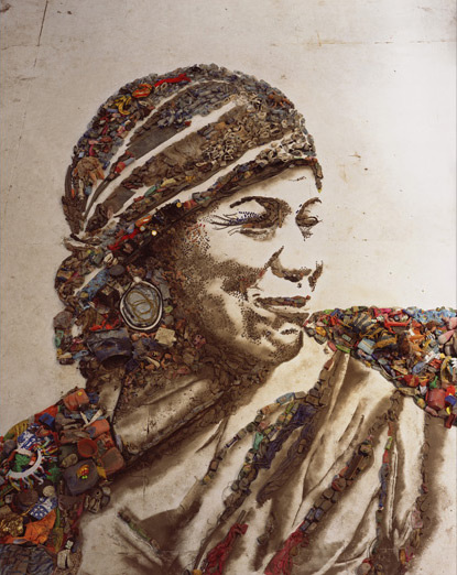
This piece by Vik Muniz is very inspiring to me because there is a lot of significance behind the piece - and the piece itself tells a story. For background behind this piece, the artist traveled to his homeland in Brazil in the outskirts of Rio de Janeiro where he meets and works with pickers of recyclable materials (the outskirts are a big "garbage" dump where these individuals live and work). When working with these individuals, Muniz photographed each individual and re-created the portraits through using dirt and trash from the waste land. He then re-photographed the final works. Through these works, the workers of Brazil were vulnerable to their despair and they began to re-imagine their lives. This piece and series is very inspirational and influential to me, because the artist went back to where he came from to not only rediscover his roots, but put himself in the shoes of others and understand their lives and how THEY live. I also admire this piece a lot because it incorporates actual elements that are from the waste land, which is representational of the subjects, where they come from, and how they live. This is the same with the dirt, and how dirt was taken from the actual waste land and created to re-create the portraits (used for the shading). This is so significant, because the elements from the waste land make up every aspect of the portrait. This represents that the waste land consumes the lives of these individuals. This is significant to the art world and humanity, because we are being exposed to lives that we have not yet (at that time) been exposed to or discovered. The pieces make us think a bit about the world as a whole, the idea of the mass amounts of trash, as well as how these individuals live their lives. I really love this work, and I think the concept behind the series as a whole is very powerful.
Image derived from: Muniz, Vik. The Gypsy Magna-Pictures of Garbage. 2010. Photograph. Vik Muniz, Rio de Janeiro, Brazil. Web. 4 Nov 2013. <http://www.wastelandmovie.com/gallery.html>.
|
 RSS Feed