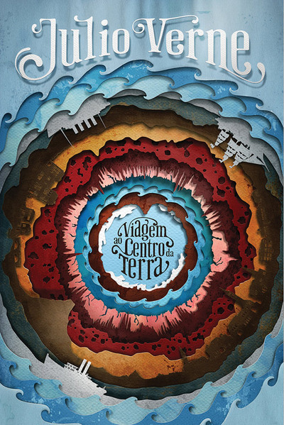
Searching for new graphic design inspiration, I've been excessively browsing the world of digital media seeking for ideas. Above, I came across an abstract-type book cover created by Randy Jones and Kevin Cornell. Although at first glance the color scheme seems a bit whimsical, after examining the cover in its detail, the scheme itself deems to be well thought out. In other words, color context was taken into massive consideration when this was created. The colors are placed in ways that create high contrast. The harsh lines created by the abstract shapes separate the colors, making the edges rough, and almost creating an emphasis on those roughened edges of the shapes. Many tertiary colors appear in this cover, and there are not pure hues. I really draw inspiration from the concept of creating dimension through layers. In this book cover, there is obvious dimension that is creating through the layering of the shapes and the high usage of detail within those shapes. Graphically, there is visible texture within each shape, which makes the objects almost 3-D like, straying away from the 2-Dimensional feel, which I also admire a lot, because there is a lot of complexity to this digital piece, yet the feel at a glance is very simple. The fact that the Phaeton-type font is placed in the center of the circular dimension created by the layering of the abstract-like shapes creates a great emphasis of the title of the book. When viewing the cover, the eye is drawn to the center of the dimension, allowing viewers to immediately notice and read the cover of the book, which is the whole point - to get people interested in reading the book. Another aspect of this design that I really admire is the fact that the objects that are presented (the boats/ships/sailboats) are silhouettes. I admire the idea of the silhouette through the concept of allowing the viewer to create their own depiction. The answer (the way an object looks) isn't simply given to the viewer, but they piece together the details in their head, which in this case, makes sense, because the silhouettes allow viewers to ponder upon the book and the choice of reading it. Overall, I feel that the piece is very well put together, and I definitely draw great inspiration from it.
Image derived from:
Giovani, Carlo. "Gay Type." ilovetypography. (2011): n. page. Web. 29 Aug. 2013. <http://ilovetypography.com/page/5/>.
Image derived from:
Giovani, Carlo. "Gay Type." ilovetypography. (2011): n. page. Web. 29 Aug. 2013. <http://ilovetypography.com/page/5/>.
 RSS Feed