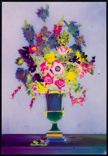
I really admire this piece for it's color usage. The piece itself is great, because it represents traditional vs. contemporary. The viewpoint of the subject matter is very traditional (face front type view), yet the color usage gives a twist to the piece. The colors within the flowers appear to be traditional at first, but then the eye moves towards the vase and the surface that the vase sits on top of, and it is apparent that the choice of hues are very non-traditional. I admire that there is a high contrast created between the objects/flowers, and each hue used for each object/flower is almost intense. The hues are off and are not pure, but are intensified through tinting and toning of those hues, which takes the idea of traditional photographs and using traditional colors and puts a twist to it - intensifying the hues and making the piece more contemporary. The piece has a slightly eccentric feel to it, but I really think the color usage is what makes this piece phenomenal. I also think the the hues and contrast really pull together well to create unity. For example, there are purple hues that appear on the surface that the vase sits on, the vase, and within certain flowers. This hue is then balance out by the yellow that appears throughout the vase and throughout the flowers again, etc. I also think that the feeling of unity is also created through the placement of the object within the piece, as well as the almost symmetrical yet a-symmetrical balance. Through the contrasted hues used within the flowers, the eye is drawn directly to those flowers and they really pop.
 RSS Feed