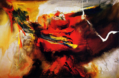
I really admire this piece for the abstraction that it presents. This piece is very similar to my last post, but it is unique in its own way. The colors that are used in this piece are warm-dominant, yet there area few subtle hints of cool colors that appear (green, blue). Although the piece itself is very abstract, the lines are very controlled and delicate. I like this piece a lot, because the piece reminds me of food coloring or water color being mixed in with water. I also love this work because it conveys a lot of emotion, similar to the last post. The color and the technique help to convey the emotion, rather than the subject matter. The most interesting aspect of this piece is the title and what it is potentially conveying with the abstract subject matter. When looking up Osage to see what it means, Osage is a native american tribe,which leads me to believe that the artist is conveying emotions about this native american tribe or the idea that it is a part of them, or that something to do with Osage caused conflict in the life of the artist, or it impacted them in some way. Overall, I really like this piece and I appreciate it for the emotion and technique that it presents.
Image derived from: Jenkins, Paul. Osage. 1956. Painting. Paul Jenkins, The New Orleans Museum of Art. Web. 29 Nov 2013. <http://www.pauljenkins.net/works/pain.html>.
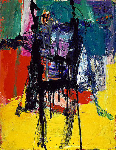
I really admire this piece for its wise use of color in a contemporary fashion. I really like the abstraction that is going on and how the colors work against each other, making the piece interesting. The technique that the piece was painted in also created a two dimensional texture. The main aspect of this piece that I admire deals with the emotions that you feel from the piece when viewing it. The piece itself does not present actual identifiable subject matter, but rather conveys a lot of emotion that the artist felt at the time that the piece was created. I also think that it is really significant how some of the chosen hues seem to have more of an impact that others do, yet the hues balance each other out very well. For example, the yellow hue seems to at first be a bit overpowering, taking up a large portion of the piece, but then the eye moves towards and black, purple, and blue hues in the middle (this section of the piece is a bit smaller), yet it balances out well with the yellow. In other words the hues were carefully chosen and placed/juxtaposed in a meaningful way in order to create an impact on the viewers. I love this piece and abstract work in general, because there is a
Image derived from: Kline, Franz. Untitled. 1959. Painting. Blog SpotWeb. 29 Nov 2013. <http://poulwebb.blogspot.com/2011/05/franz-kline-abstract-expresssionist.html>.
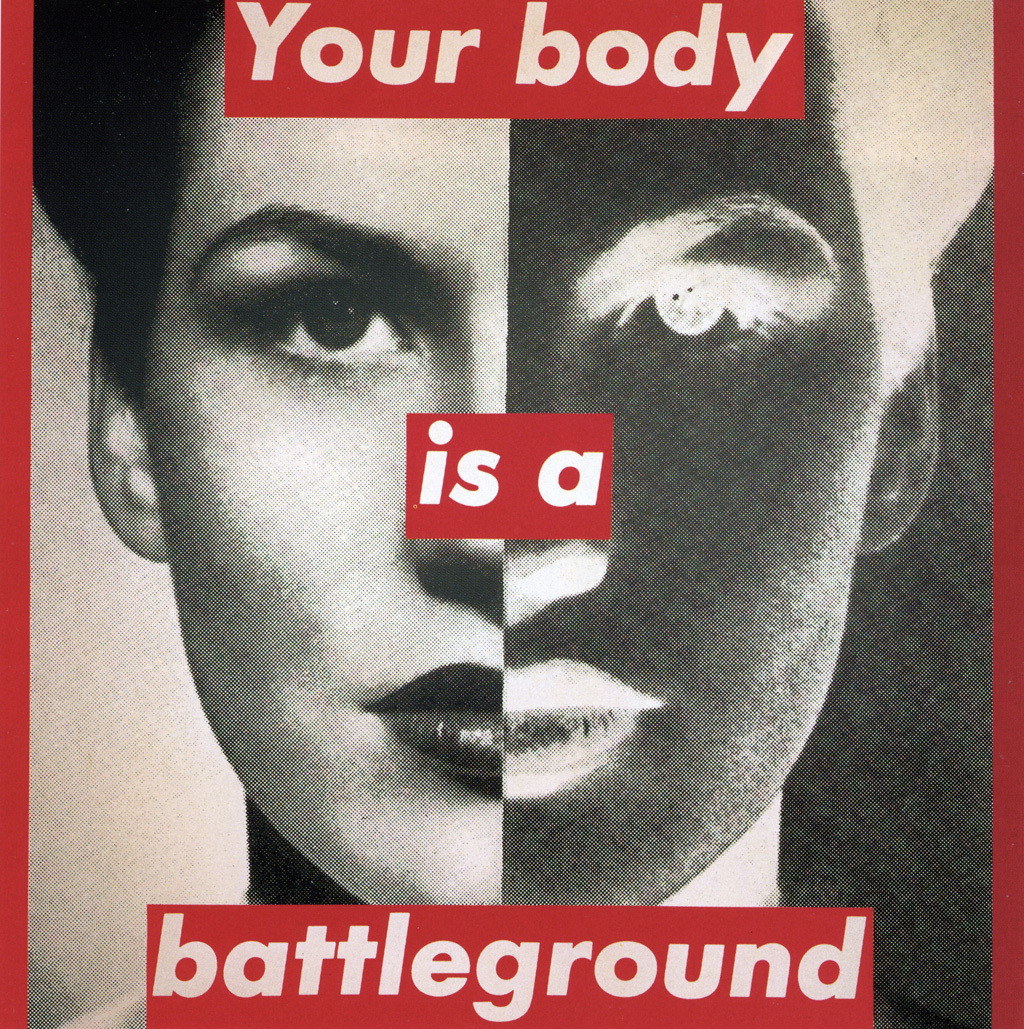
I like this piece a lot and I think that although this piece is dated, it is very inspirational even to women today. I think the concept of this piece is very interesting, and I like the composition and the harsh contrast. I feel that the contrast that this piece presents adds to the darker mood that is being conveyed. The piece is very bold, and the use of the bold, red text also adds on to this feeling of hostility almost. This piece reminds me of an internal vs. external conflict of the inner self. The left side is what we really see on the outside (or what the subject sees of herself), but the right side represents the internal workings or internal being that this woman/subject sees within herself. This piece is very confrontational, and the text is the first thing that I see what I look at it. The concept and message being portrayed is simple, yet it is very powerful. When we think of the internal battle we have with ourselves about our appearance and how we are as human beings, it brings out the worst emotions in us at times, and the red hue chosen with the text really brings this idea up and shines a light on it. I also think that the black and white photographs help effectively convey the theme
Image derived from: Kruger, Barbara. Untitled (your body is a battleground). 1989. photographic silkscreen on vinyl . n.p. Web. 29 Nov 2013. <http://faculty.txwes.edu/csmeller/human-prospect/ProData09/03WW2CulMatrix/WW2PICs/Kruger1945/Kru1989Body400.htm>.
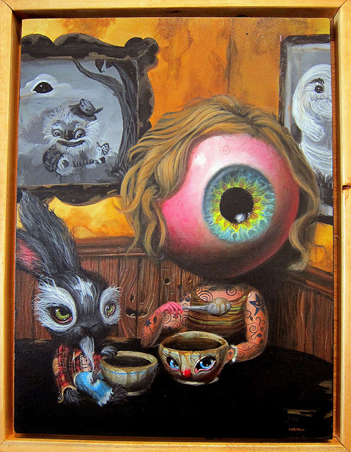
In a sense, this piece reminds me of Alice in Wonderland and the whimsical environment that the movie presents. When I view the large iris as the head, I think of the concept of the third eye and a higher consciousness watching everything that we do. When I look at this piece, my take on it is that the things that we see shape our sentiment towards certain ideals and situations. I think that the star on the forehead of the rabbit is interesting, and when I think of a star I think of reaching to the sky and the idea of the sky NOT being the limit so we can accomplish our true dreams. I get a bit lost when looking at the iris with the idea of the hair making it a bit feminine, and I am not sure how this adds significance to the piece. I also am unsure as to how the tattoo-like qualities of the body of the iris adds meaning to this piece, and if it does at all. The biggest connection I make to the star-like tattoos on the body of the iris-like head are that when we follow and reach to accomplish the goal of pursuing our dreams, our dreams begin to embody us and define who we are as human beings and what we want in life, which could actually be significant in this work. I really admire the surrealist-like qualities of the piece and how it appears to be realistic in a distorted way. The coffee (if that is what it is) also appears to play a significant role in this piece. If you think about modern-day society, many have become dependent on caffeine in order to work harder and harder to accomplish and pursue our dreams and goals.
Image derived from: Brown, Mark. Iris in the Corner. 2010. Painting. FlickrWeb. 25 Nov 2013. <http://www.flickr.com/photos/jeremyriad/4756444314/>.
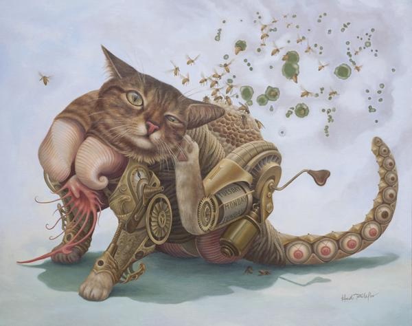
I really love this piece for the concept of surrealism and the uniqueness that it presents through the subject matter. The cat appears to be very mechanical and machine-like, and is conveying movement through the present posture/pose that the subject has been created in. I her explanation where the artist talks about what this series is about (this piece is apart of a whole series), she writes "Originally believing that we shape our own lives, these experiences opened up the possibility that destiny is also an unavoidable aspect of our being." This is significant to this piece, because this makes sense in context with the subject matter and the title of the piece itself. When I think of the cat, the cat (to me) is symbolic of intuition or being intuitive. Cats wander and go places and do things without thinking about what they are doing. Bees symbolize wisdom through the idea that they collect pollen from a differentiation of flowers and turn the pollen into honey (they are smart and understand how to turn one thing into another). From this piece, I take away the idea that the more we work and the the more experiences we endure, the more knowledge we gain, and the more we begin to understand about the world around us and ourselves as individuals and who we are as internal beings. Through our work and things we experience, we do not know and we cannot plan where we will end up in life, but we let destiny guide us and take us there. The visual aspects of this piece are also very intriguing through the idea that they are very realistic yet surreal, which parallels with the idea of life (it is as realistic as it gets). Every external and internal detail is conveyed. The posture of the cat in this piece is also very significant, and I also feels that this adds onto the concept of destiny. Cats typically only scratch their ears if there is infection, which generally is unexpected and is unplanned (infection occurring). I love this piece because it is not only viually appealing, but i
Image derived from: Taillefer, Heidi. Power Hive. 2009. Painting. Heidi Taillefer, New York, New York. Web. 25 Nov 2013. <http://heiditaillefer.com/Power_Hive.html>.
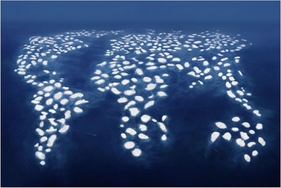
I think this photograph is very interesting in regards to the concept that it presents. This piece presents a photograph of an actual project that was created. This is a photograph of a group of artificial islands that lies right off of the coast of Dubai, and the group of islands are roughly shaped into the continents of the world. The islands were created out of sand from Dubai's ocean front. As of late, the islands are slowly beginning to sink and this project is still a controversial issue. I like this photograph, because when I look at this piece, I think of the idea of global warming and humanity doing things that are slowly killing our Earth. I also like this piece, because it is very simplistic, but it conveys a lot of meaning that also brings a global issue to light. The piece itself consists of similar shapes that create the overall figure/shape of the seven continents. There is a lot of repetition through the use of those shapes, which creates unity. The way that the piece was photographed also creates an asymmetrical balance, yet emphasizes this shape. There is also a high contrast between the shapes and the ocean, which highlights the shapes and makes them stand out a bit more. The emphasis and simplicity of this piece works very well, because it does a good job at conveying the message that with the more and more technology that we use daily, the more we are destroying our planet and ruining our Earth. For example, the more cars we use, the more carbon emissions get into the environment, raising the global temperature, causing the polar ice caps to melt, and affecting global ecosystems and food chains, causing animals to die off, etc. It's a never ending cycle. I feel
Image derived: Gursky, Andreas. Dubai World III. 2008. Photograph. ASXWeb. 25 Nov 2013. <http://www.juancole.com/2012/07/dubai-world-iii-gursky-photograph.html>.
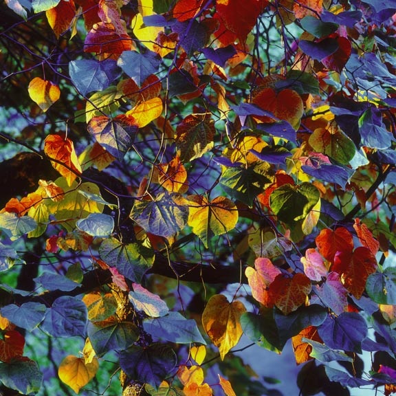
I admire this piece for a few different reasons. I think that this piece really works, because the angle is a close up and it captures many of the different leaves, which creates a feeling of repetition throughout the piece, which also creates unity. I also really admire the color usage in this piece and I feel that it works really well. The hues in this piece work really well, because there is a repetition of the different hues that repeat throughout the piece, which also adds on to the feeling of unity and pulls the piece together. I also feel that the focus of this image makes it interesting, because the leaves that are closer are more visible and detailed while the leaves that are further away are blurred out, drawing your eye to those leaves that are nearer to the lens. I admire this piece a lot because it captures nature in an interesting and unique way. I think that the angle captures the details of the leaves that makes the piece really interesting. It is intruiging, because people do not take the time to look at the smaller details that nature presents, and this piece does a good g
Image derived from: Burkett, Christopher. Resplendent Leaves at Sunset. 2002. Photograph. After Image Gallery, Sunset, Oregon. Web. 21 Nov 2013. <http://www.afterimagegallery.com/burkettresplendentleaves.htm>.
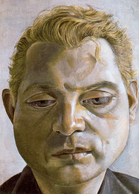
I really admire the work of Lucian Freud, especially his unique portraiture. Being very drawn to portraiture already, this piece really stands out to me. I like this piece for the technique. This piece presents a traditional style, but in a twisted way. The piece itself is balanced very well through the angle that was chosen.The portrait exposes the subject in a traditonal-like way, capturing all of the features of the subject from a frontal-type view. This piece starts to become non-traditional through the palette/hue choices, and the structure of the facial features. For example, the eyes look a bit cartoon-like and slightly distorted. The eyes themselves appear to be very large (wide-eyed, rounded - making them very cartoon-esque). The face itself is very rounded, which could be realistic, but in real life this is not usually the case. The hues chosen for this piece are also a bit off, and the palette is not traditional. The whites appear to be slightly toned with a blue, and the darker hues on the left side of the face are toned down, and are not as vibrant in regards to skin tone. I admire this piece for the idea that it captures the subject in a realistic way. All of the details of the face are included, the tones and lighting is correct, the hair is detailed down to the wire, etc. I admire the lack of color in this piece, and how the facial expression is not happy - creating a specfic mood. The subject appears to be in thought or pondering on something, and the chosen color palette does a good job at capturing this. I love how this piece emphasizes and focuses on emotion, which is very inspiring to me.
Image derived from: Freud, Lucian. Portrait of Francis Bacon by Lucian Freud. 1952. Painting. Ananas à MiamiWeb. 20 Nov 2013. <http://2.bp.blogspot.com/-lbgZuoG83PI/TdLTCaax4eI/AAAAAAABbCs/yOa1AO4JAuU/s640/Lucian Freud - Francis Bacon 1952.jpg>.
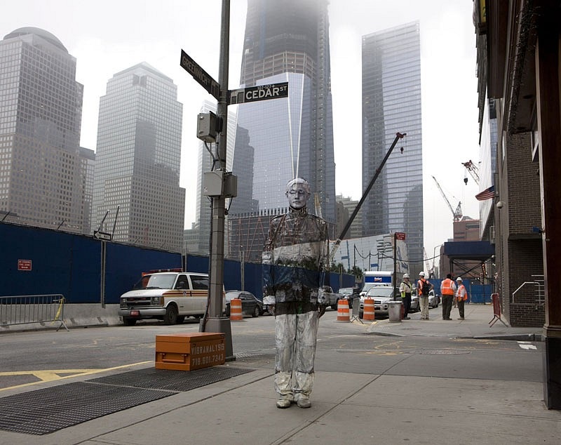
Browsing through art work online, I came across photography Liu Bolin (Japanese). A lot of his works revolve around a theme of blending in or disappearing into the objects that surround us. This photography really appeals to me and I think that it is very impressive. For starters, I feel that the angle that this photograph was captured at really makes it interesting. There is an entirely new perspective through the idea that we not only visibly see the figure blending into the city, but we see the city, the tall buildings, and the potential size of the city. I also think it is interesting that there are other individuals in the background who are minding their own business and doing whatever it is that they are doing. This piece is very conceptual, and it sends a very inspirational message (this piece really speaks to me). Even in one of the biggest cities (assuming that this is New York), an individual can get lost in the swarm of people. People can get lost in their city, in humanity, in the things that they do - addictions, bad habits, etc. We cannot let ourselves get lost and lose our voices. We cannot let ourselves blend into society, but we rather have to stand out and voice our opinions. We need to stand our and contribute positively to this world before it is too late. We all have one life to live, and we all have one shot at doing so. Asides the conceptual meaning that I take away from this piece, I think that the overall po
Image derived from: Bolin, Liu. Hiding in New York No. 4 - Ground Zero. 2011. Photograph. Eli Klein Gallery, New York, New York. Web. 20 Nov 2013.
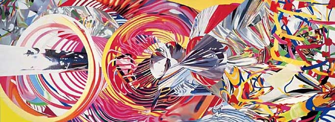
I really appreciate and admire this piece mainly for its use of color and shape. I love the abstract feel that this piece presents, and I think that the title of the piece is interesting with the subject matter that the piece presents. In a way, I feel that the title is very contradicting in a sense. The internet defines the term Stowaway is an individual who secretly boards public transportation without paying and without being detected/noticed. The speed of light also travels so fast, that we as humans do not physically see it. I admire this piece because It is an interpretation of the speed of light and what it would or potentially could look like it if it was actually visible to the human eye. When I think of light, I think of colors and how different colored objects and things model light and reflect it. In this piece, since the speed of light moves so fast, the objects becomes blurred lines and appear to be very abstract, organic-like figurative forms of color. I feel that this piece makes a lot of sense in terms of the approach to the subject matter combined with the chosen title, and I think it is a great depiction., This piece goes "outside of the box" and depicts subject matter and questions our existence and the way that things work a bit, which I think is an interesting concept. This piece is great because it is not simply a portrait or a depiction of a type of subject matter that we are exposed to every day and th
Image derived from: Rosenquist, James. Stowaway Peers Out at the Speed of Light. 2000. Painting. Guggenheim, New York, New York. Web. 18 Nov 2013. <http://pastexhibitions.guggenheim.org/rosenquist/highlights8.html>.
|
 RSS Feed