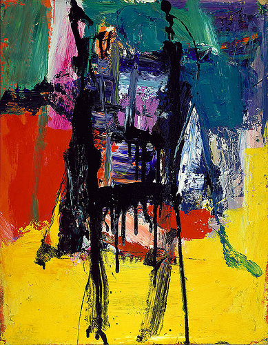
I really admire this piece for its wise use of color in a contemporary fashion. I really like the abstraction that is going on and how the colors work against each other, making the piece interesting. The technique that the piece was painted in also created a two dimensional texture. The main aspect of this piece that I admire deals with the emotions that you feel from the piece when viewing it. The piece itself does not present actual identifiable subject matter, but rather conveys a lot of emotion that the artist felt at the time that the piece was created. I also think that it is really significant how some of the chosen hues seem to have more of an impact that others do, yet the hues balance each other out very well. For example, the yellow hue seems to at first be a bit overpowering, taking up a large portion of the piece, but then the eye moves towards and black, purple, and blue hues in the middle (this section of the piece is a bit smaller), yet it balances out well with the yellow. In other words the hues were carefully chosen and placed/juxtaposed in a meaningful way in order to create an impact on the viewers. I love this piece and abstract work in general, because there is a
Image derived from: Kline, Franz. Untitled. 1959. Painting. Blog SpotWeb. 29 Nov 2013. <http://poulwebb.blogspot.com/2011/05/franz-kline-abstract-expresssionist.html>.
Image derived from: Kline, Franz. Untitled. 1959. Painting. Blog SpotWeb. 29 Nov 2013. <http://poulwebb.blogspot.com/2011/05/franz-kline-abstract-expresssionist.html>.
 RSS Feed