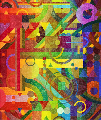
It's the color usage, the shapes, the abstraction, the use of line, the uplifting feeling that I get when I view this piece. I love how there is almost a clash of warm and cool colors, yet they create unity through the way the composition is laid out and through the placement of colors/juxta-positioning of the colors next to one another. There is a modernistic feel, and a sense of energy that comes from the piece. There is an "in your face" kind of feel through the harsh edges of the shapes, and there is visual appeal through the differentiation of line weights, and sizes of shapes. There is a variation of pattern, which to me is phenomenal, because, although there is a large variety of patterns, they are laid out in a way that allows them to unite. In other words, certain elements of certain designs appear all throughout the piece, and certain patterns collide with the other designs, pulling the composition together. I feel that this directly relates to the current digiral project we are working with in adobe illustrator through the concept of working with different line weights, patterns, shape, negative/positive space, etc. The only difference is that we are working in black and white.
Image derived from: Nelson, Nick. Future Patterns. 2012. Digital Composition. WeHeartItWeb. 11 Sep 2013. <http://weheartit.com/entry/29167175/via/scrapps>.
Image derived from: Nelson, Nick. Future Patterns. 2012. Digital Composition. WeHeartItWeb. 11 Sep 2013. <http://weheartit.com/entry/29167175/via/scrapps>.
 RSS Feed