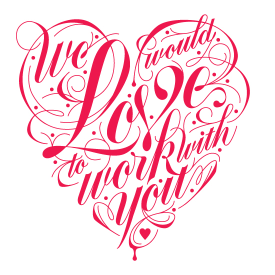
Even though this typography piece consists of only one hue (a hot pink/darker pink), I like the composition of the piece. Since the piece was also made for Valentine's Day and for a restaurant, I think the overall design is very clever. I love the idea of the words being shaped into a heart for the theme of the holiday. I also love how clean this piece is. The line work is great, and the curvature of the line work flows very well. I feel that wit this piece in particular, the artist did a great job at choosing which words to make larger and which words should be of a smaller scale. The word "Love" is the largest word, and this is very significant, because it not only grabs the attention of the viewers, but it also connects to the holiday and creates a connection between the restaurant and the viewers. Although the lettering is very bold, the curvature of the text and the lined designs that surround the text give the piece a softer and more flowing feel, which is also how Valentine's Day should be. It is full of love and happiness, which i what this piece conveys. Overall, I feel that this piece is simple, but the design of the font and the line work conveys the theme and feeling very well.
Image derived from: Davis, Danielle. Love Lettering. 2013. Typography. Danielle is HereWeb. 8 Oct 2013. <http://www.danielleishere.com/work/tastelove.html>.
Image derived from: Davis, Danielle. Love Lettering. 2013. Typography. Danielle is HereWeb. 8 Oct 2013. <http://www.danielleishere.com/work/tastelove.html>.
 RSS Feed