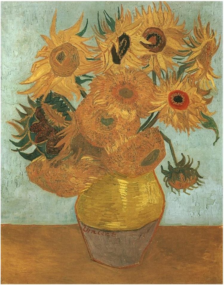
I love Van Gogh's still life paintings/drawings and I think that they are fascinating for a variety of reasons. This piece is interesting, because it illustrates the life cycle or how all living things connect in some way. The flowers in the vase itself are not all completely lively. There is a flower or two that are very vibrant and appear to be full of life. The yellow hue is highly contrasted, and the pedals of the flower peak out and stand taller, which subtly contrast with the flowers that are in the process o dying, or the flowers in the vase that have already died. For example, the flower in the upper left corner of the piece has slightly wilted pedals, and the hue is slightly duller and toned down. I then see the flowers in the middle of the painting/center of the vase that are an even darker and duller hue of yellow than the other flowers, which represents the death of the flower. This is such an interesting piece, because it represents the life cycle all in one piece - and we all relate to this because that is what everything on this planet encounters - life and then death. I also think the light blue hue that was chosen as the wall color is interesting because when we think of light blue, we think of calmness. This is very significant to the concept of the piece, because eventually all living things have to come to terms with the idea that death will eventually be near. It represents the idea of being at peace with the life cycle and accepting the idea that anything can happen at any given moment.
Image derived from: Van Gogh, Vincent. Still Life: Vase with Twelve Sunflowers. 1889. Painting. Van Gogh Gallery, Philadelphia , Pennsylvania, United States of America. Web. 14 Oct 2013. <http://www.vangoghgallery.com/catalog/Painting/595/Still-Life:-Vase-with-Twelve-Sunflowers.html>.
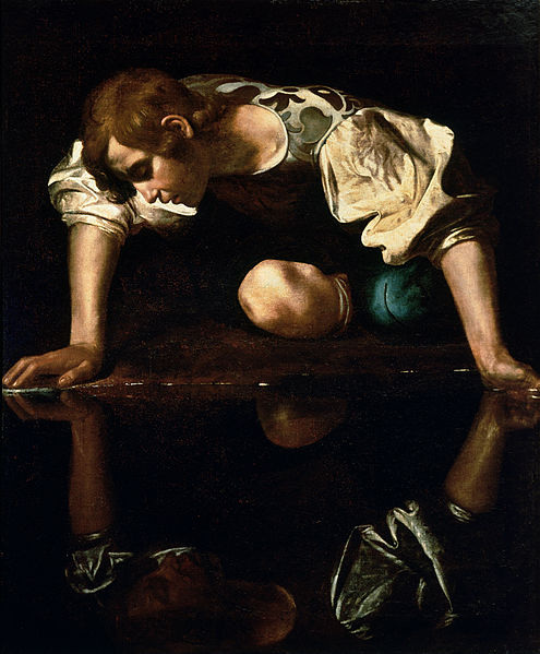
Typically I have never been that interested in traditional painting, but after learning and reading about Caravaggio and his work (this piece in particular) I became very interested. In a contemporary era, I am still learning a lot about traditional art, but I really admire this piece for the subject matter as well as the story/concept being conveyed. The story behind the piece is that Narcissus is a handsome young man who ends up falling in love with his own reflection. The idea behind the piece is that people who fall too in love with things end up being unhappy (for example, people are too vain, too materialistic, etc.) Although this piece was created a little over 400 years ago, the concept it presents still holds true - if you place too much emphasis on greed, you will be unhappy. The subject in the piece is being greedy by placing too much emphasis on himself, and the contrasting darkness surrounding the subject illustrates the idea of unhappiness. The piece itself is dark, which helps convey the concept immensely. The facial expression of the subject comes across as unhappiness as well, which also helps convey the concept. It also appears that the shirt that the subject matter is wearing is emphasized through light, which also draws on the idea of being too vain and materialistic (placing too much emphasis on the materialistic items we own falsely makes us happy, and also adds on to the idea of an individual being vain... clothes enhance one's appearance, etc). This piece is very clever, and the concept itself it great. I really admire this piece a lot, because it's concept will live on forever
Image derived from: Caravaggio, . Narcissus. 1597-1599. Painting. Caravaggio: The Complete Works, Rome, Italy. Web. 14 Oct 2013. <http://www.caravaggio-foundation.org/Narcissus,-c.1597-99.html>.
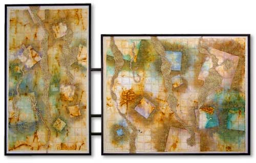
When viewing this piece, I really admire the piece for the combination of the different mediums, as well as the abstraction of the piece. When viewing this work, it has a map-like feel. The map-like piece appears to be torn all over, and the hues are faded into the cotton. As if the map is broken apart and the continent like objects are fading and rusting away. I interpret this as a comment on society and our world and how the negative things that are happening and the fact that we are destroying ourselves is destroying the planet. Although the shapes are squares, they have an organic feel to them (the squares do not look perfect, are not completely symmetrical). I draw on the map interpretation not only from the placement of the broken apart squares/shapes, but also from the quilted/layered cotton that creates a grid. When I view the grid, I am reminded of the latitude and longitude lines that you see on a map. The chosen hues of the faded blues and greens also remind me of the concept of a map (the ocean is blue, the green represents the continents). To me, the rust symbolizes something that is falling apart and is becoming weak and unstable, which many think that this is happening to our society and our world (for example, our modern generation is more materialistic than we used to be, we possess on average 25 electronic items per household, we consume gas and are destroying coal mines, we are destroying the planet by cutting down all of the trees, etc). This drawing in fact IS a comment on society and how we are destroying ourselves, and I strongly connect to this piece because I completely agree with it's conveyed concept, and I feel that this piece is accurate, and it is very well done. I love the concept, the choice of combined mediums, as well as the way it is hung and presented to viewers. On the left side, the shapes are put together and there is slightly more color than on the right side. The left piece is the symbolism for the beginning of the destruction, and the right side is the actual representation of the destruction. I love this piece, and I think it is very clever, and I appreciate this piece in many, many ways.
Image derived from: Camp, Lauren. Earth Drawing II. 2008. Photograph. Lauren Camp, threadwork on rusted, painted and layered cotton; aluminum. Web. 10 Oct 2013. <http://www.laurencamp.com/art/earth-works.shtml>.
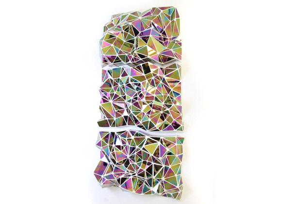
I really like this piece for its intricacy and the concept of the mosaic theme. This piece is interesting, because there are a lot of elements and principles of art and design that can be pulled from it. When viewing this piece, the individual jagged shapes come together to form one big picture, but the picture isn't clear. The overall picture created within the shapes creates one big abstract piece. This is created through the repetition of the shapes, the repetition of the jagged lines, the repetition of the similar hues throughout the different shapes, as well as the use of balance. There is also a lot of movement through the lines that are created by the shapes being put together. The white lines created by those shapes being put together as well as the white background guide your eye through the piece so you are led to look at the entire composition as a whole. There is also a visible texture, not only through the appearance but through the medium choice as well (the glass). Not only is unity created through the element of repetition, but harmony is created. I really love this piece for it's traditional idea (mosaic pieces), yet it presents a contemporary feel through the abstract and contemporary color usage. The choice of medium is also very unique in combination with the color choices. As a three dimensional piece, the work itself is very clean and well presented, which I applaud the artist for, because I think this is difficult to do when working with glass.
Image derived from: Caldwell, Graham. Large Polychrome. 2011. Iridescent glass and epoxy. Graham CaldwellWeb. 10 Oct 2013. <http://www.grahamcaldwell.com/works.html>.
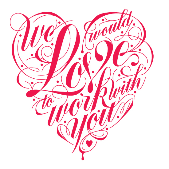
Even though this typography piece consists of only one hue (a hot pink/darker pink), I like the composition of the piece. Since the piece was also made for Valentine's Day and for a restaurant, I think the overall design is very clever. I love the idea of the words being shaped into a heart for the theme of the holiday. I also love how clean this piece is. The line work is great, and the curvature of the line work flows very well. I feel that wit this piece in particular, the artist did a great job at choosing which words to make larger and which words should be of a smaller scale. The word "Love" is the largest word, and this is very significant, because it not only grabs the attention of the viewers, but it also connects to the holiday and creates a connection between the restaurant and the viewers. Although the lettering is very bold, the curvature of the text and the lined designs that surround the text give the piece a softer and more flowing feel, which is also how Valentine's Day should be. It is full of love and happiness, which i what this piece conveys. Overall, I feel that this piece is simple, but the design of the font and the line work conveys the theme and feeling very well.
Image derived from: Davis, Danielle. Love Lettering. 2013. Typography. Danielle is HereWeb. 8 Oct 2013. <http://www.danielleishere.com/work/tastelove.html>.
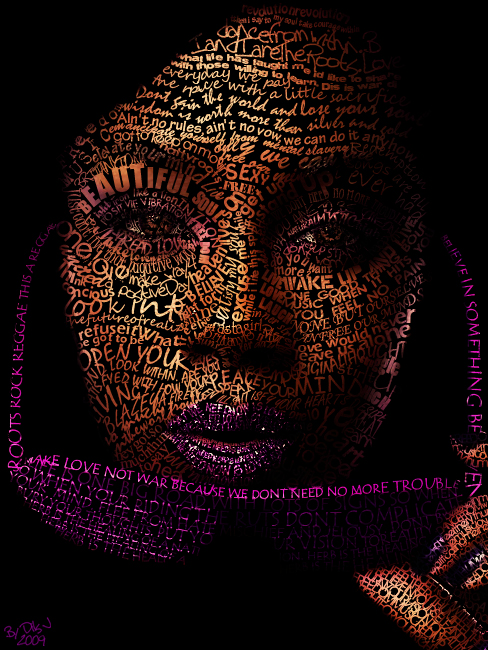
I admire this digital piece, because it takes the idea of contemporary portraiture and goes beyond that. When we think of words, we do not think of them being on the face of an individual. When we think of words, we think of newspapers or books or something you can physically look at tot read. When I see this portrait, I think of the idea of being able to read someone's emotions, but this piece goes beyond that concept. The piece presents the idea of putting an individuals every single thought/opinion and putting it onto their face for all to physically see. This piece portrays physically being able to read an individual's mind (since that is not possible, this piece is exploring that concept). This piece is great, because the artist not only focused greatly on the placement of specific texts and the text sizes, but the artist also focused on the values of the hues of specific texts and words in order to make the portrait as a whole appear to be more and ore realistic. There is a huge contrast of the text/face and the black, which allows the portrait to appear to be even more realistic and creates an emphasis on the words (they do not blend in to a lighter background). The words jump out at you and grab your attention. I also think the piece holds a lot of conceptual meaning, because selected words are bigger in size than others. Words/phrases such as "Beautiful, look into and open your" are larger than some of the other text. I also think the concept of the sunglasses is a great addition, because it is as if the subject is taking off the sunglasses to reveal herself and who she really is. The fading of the words/phrases that create the illusion of the sunglasses also adds onto this idea, The words/phrases of the sunglasses are not as interpretable, yet the words/phrases that create the portrait/subject are. This is one
Image derived from: Wicks, Cris. Lyrical Portrait. N.d. Digital Media. Art-SpireWeb. 7 Oct 2013. <http://www.art-spire.com/en/graphic-design/cris-wicks-lyric-portrait/>.
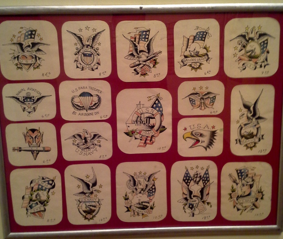
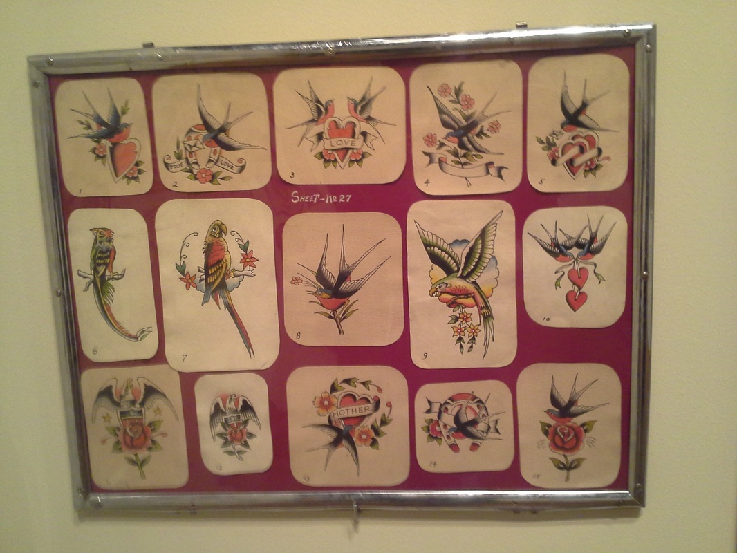
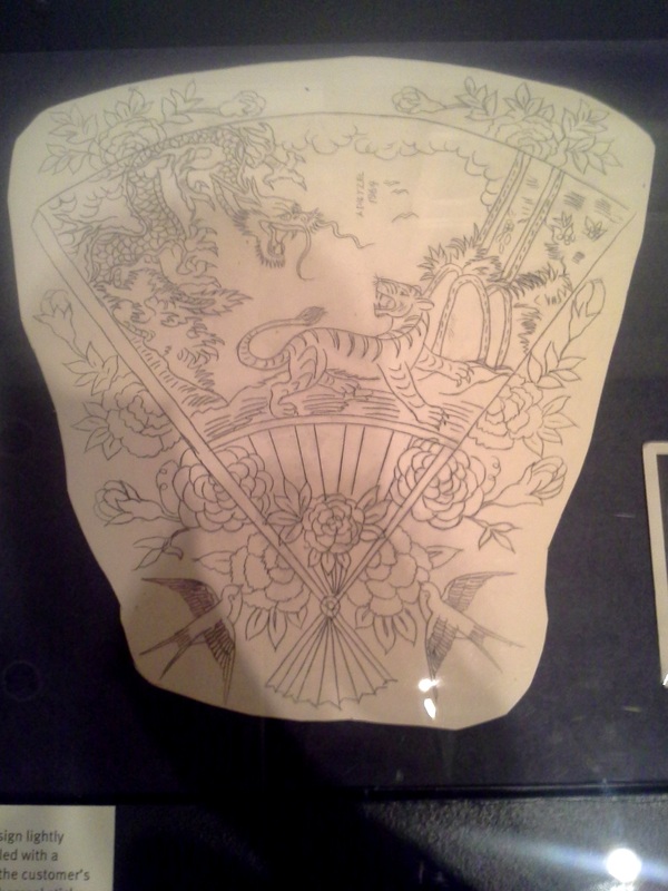
The Flash Art of Amund Dietzel is so classical and traditional, yet they are unique. Each tattoo design has its own feel and originality, yet it is clear that all designs were created by the same artist. It is amazing to look at his work, because Dietzel set the example for many modern tattoo artists, and even today similar designs are seen all the time. I love his work the most, because not only do I adore tattoo art, but with these pieces in particular, I want to take a moment to look beyond the artistic elements and principles and look at the story that this art tells.Old school/traditional tattooing was the start of what it has become today. There weren't "professional" tattoo artists or tattoo artists that had an art degree, and the equipment was not as advanced as it is today, therefore the designs had thick lines and were bold in color. When tattooing first started out, there were many common tattoos, such as the anchor, the sparrow, cherries, a heart, roses, and many more - yet they all held their meaning. Dietzel's work is significant, because to me, his work was the bridge between traditional art and new-age/modern art. While his tattoo designs are still old school and traditional, many of his pieces have great detail, which is all modern tattoos are about - detail, detail, detail. A great example of the intricacy of his work is the bottom sketch. It is not simply a sparrow, a heart, an anchor, or just a traditional design. While there are traditional elements incorporated into the design, it is more complex, having different traditional elements placed into a larger composition, which really - made Dietzel's work stand out. He was a step ahead of the era, which I think it amazing.
Image derived from: Dietzel, Amund. The Flash Art of Amund Dietzel. 1913. Tattoo Art. Milwaukee Art Museum, Milwaukee. Web. 6 Oct 2013. <http://mam.org/exhibitions/details/tattoo.php>.
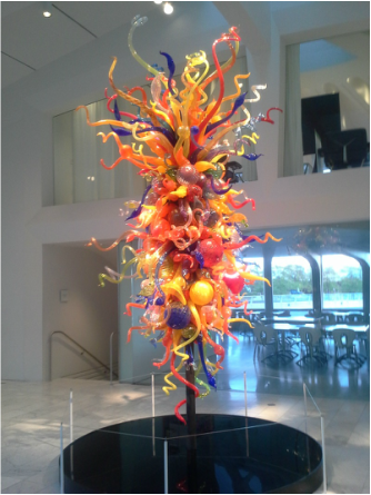
In high school I studied Chihuly a bit and was exposed to his work, and I have actually seen this piece photographed online before, and I think Chihuly's work is phenomenal and it is very inspiring to many artists.Seeing his work in person is a completely different experience. The image above is actually an image I took from when I visited the Milwaukee Art Museum and was able to look at Chihuly's work. His works (this one in particular) are huge, and when viewing them, his work has such a significant impact on viewers. The sculpture itself it very whimsical and full of life. Many or all of the individual shapes in this sculptural piece spiral or are rounded. When I think of this, I think of life and how it is never ending and how we are constantly evolving as a society. The spirals are never ending, just like the spherical shapes. The colors represent all different aspects of life. Some aspects of our lives are darker, and some are lighter and happier. We are consistently working to better ourselves (individually and as a whole), and I feel that this piece represents just that. Even more significantly, the spiral-like shapes point in all directions, which could also symbolize the idea that life pulls us in many different directions, and we never know what is coming next. We can try and plan our lives months and months ahead, but it can all change at the blink of an eye. This piece does a great job at creating strong connections with its viewers, and I am very admirable of this piece.
Image derived from: Chihuly, Dale. Isola di San Giacomo in Palude Chandelier II. 1941. Scuplture. Milwaukee Art Museum, Milwaukee. Web. 6 Oct 2013. <http://collection.mam.org/details.php?id=11181>.
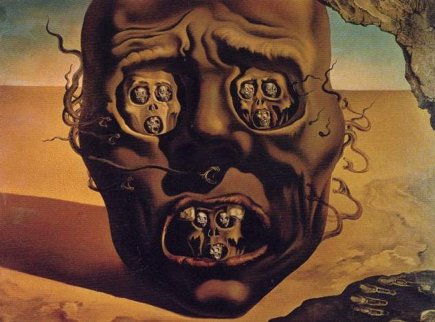
Dali has always been a huge inspiration to me, because his works are conceptually and visually complex. I am drawn to this piece in particular for the darker concept being conveyed. It reminds me of the "See no evil, hear no evil, speak no evil", except it is the exact opposite. The mysteriousness behind this piece is fascinating. It also reminds me of being in a bad dream and waking up from it and still having it pounded into your head and being frightened from it. I love this piece because it is one of Dali's less complex pieces, and the piece is conceptually easier to understand. I love how Dali used a variation of the same hue to create a darker feel to the piece (there is a hug variation of browns used). I also really like how this piece conveys the concept in a very non-traditional way. In other words, there is not simply a human face with a scared expression. There is an obvious face that is detached from the body, which makes me think of the idea of one's brain being wrapped up in something (a bad dream/omen). The head is placed in the middle of a desert-like environment, which also makes me think of an abyss of nothingness or the mind, because the mind is kind of similar to a blank canvas that we fill with ideas and thoughts, but in this piece there is obviously no control over these thoughts. The distortion of the face is also significant, because it also conveys the idea of fear. The face looks like all of the color has been drained from it, like when you see something and you begin to feel fear and all of the blood drains from your face. This piece is significant, because we all feel fear, whether it is physically/visually or mentally/visually.
Image derived from: Dali, Salvador. The Face of War. 1941. Painting. Salvador DaliWeb. 3 Oct 2013. <http://www.edali.org/the-face-of-war.jsp>.
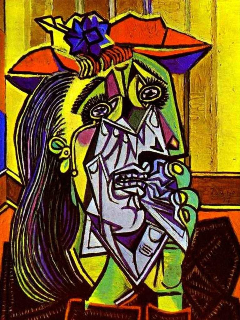
I really like Picasso's work for its originality and abstract approach. This piece is conceptually intriguing because there is a conveyance of emotion as well as the clash between how someone portrays themselves vs. how an individual is really feeling. In this piece, the subject/woman appears to be emotional in a sense, which is somewhat visible from the exterior, but from the interior view that Picasso presents from the idea of the flesh being ripped away or it appears to be x-ray like. The choices of hues also conveys this idea. For example, the flesh of the subject is yellow and green. When we think of a green hue on the face of a subject, we think of sickness or being sick. The blue on the interior or where the flesh seems to be gone conveys sadness, because when we think of blue hues in accordance with emotions, we think of sadness or being calm. The subject is holding an object in her hand, which from my perspective, is a handkerchief (this makes sense with the title and the clash of interior vs. exterior). The edges of the subject's figure are also sharp, and outlined, giving the piece a sharp/edgier feel. This piece is significant, because I feel many people can relate to this. We all have points where we feel low or we are upset by something, and the piece does a great job at conveying emotion. It isn't necessarily about the subject itself, but rather about the emotion and experience that is being conveyed through the subject in the piece.
Image derived from: Picasso, Pablo. The Weeping Woman. 1937. Oil Painting. Amazing Kids MagazineWeb. 2 Oct 2013. <http://mag.amazing-kids.org/ak_columns/amazing-kids-adventures/amazing-kids-adventures-picasso-at-the-seattle-art-museum/>.
|
 RSS Feed