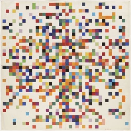
I really like this piece because I think it is very ironic or coincidental in a sense. The piece itself reminds me of pixels that come together to create a larger image (like on the computer or when you are working in photoshop on an image and you can see the actual pixels on the computer screen that create the image). This piece is ironic to me, because it was created in 1951 (before technology took over the world and became a huge concept) - yet in the modern age, the piece depicts or can be interpreted as being symbolic of or similar to technology. i appreciate this piece not only for its abstract feel, but for the experimentation with the juxta- positioning of the hues. The piece appears to portray that the individual squares are working together to create a larger image - although this may NOT be what Kelly was going for, this is how I personally interpret the piece. I admire the title though, and although the title implies that the colours were arranged randomly, if you think about it, this cannot be true, because the artist clearly has a color palette that was thought out in some way (there are similar hues that appear throughout the piece, creating a feeling of unity and balance). I admire this piece for the abstraction yet geometrical feel, and I admire the thought that was put into laying the colors out in a way where t
Image derived from: Kelly, Ellsworth. Spectrum Colors Arranged by Chance II. 1951. Painting. The Museum of Modern Art, New York, New York. Web. 28 Oct 2013.<http://www.moma.org/collection/browse_results.php?criteria=O:TA:E:ex4561|A:TA:E:ex4561&page_number=3&template_id=1&sort_order=1>.
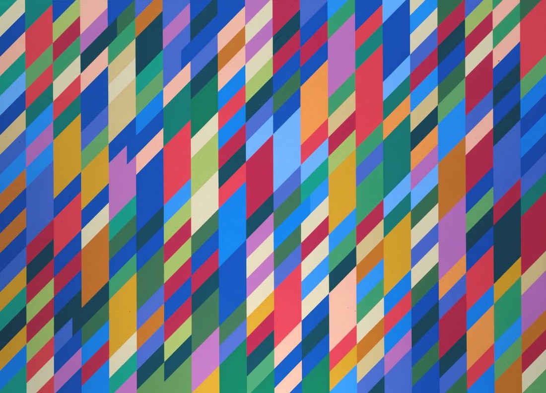
This piece is very interesting to me not only through the use of geometric shape and the juxta-positioning of the hues, but the concept and name of the piece is interesting. The piece itself is named after a term that derives from Hindu mythology, which means "Lord of the Dance". The term relates to the Hindu god Siva (or Shiva) who was a cosmic dancer. In the Hindu religion, Siva was symbolic and representational (and still is) of the cause or source for movement of and within the entire universe. The use of the term in Riley's work refers to her use of rhythm and movement created through the repetition of the geometrical shapes, as well as the repetition of similar or the same hues throughout the piece, and the creation of lines through the positioning of the shapes (or vice versa - lines that were made created the shapes). There is also a feeling of unity created through the repetition of the shapes, as well as the colors. I really admire this piece for the fact that is creates movement on a surface in a two-dimensional way, and I also am really drawn to the title, where the title originated from and how it adds significance to the piece. There is also a high contrast overall that is created through the harsh lines that clash with each other, as well as the harshness of the colors and the idea that they do not blend together, which I think is very contemporary, yet adds a lot of character to this piece.
Image derived from: Riley, Bridget. Nataraja. 2006. Painting. TateWeb. 28 Oct 2013. <http://www.tate.org.uk/art/artworks/riley-nataraja-t06859>.
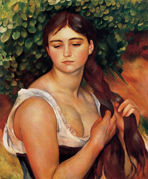
I really admire this piece for a few different reasons, and it also is very significant at the moment to my drawing I class, because we are working on human portraiture and figure drawing. The angle of the subject is very interesting because it captures an everyday aspect of life for many - the action presented by the subject is subtle, but it is significant to every day life and many viewers can relate to this. Growing up, younger girls are taught to braid their hair, and it is one of the first things that many young girls learn early on in their childhood. To me, this piece seems to convey the idea of childhood vs. womanhood and that clash in between the transitional stage. For example, the face looks very young, while the body is more filled, and the hands of the woman appear to be older and a bit aged (but not TOO aged). The clothing that the woman is wearing is also very revealing, which indicates maturity. The fact that the woman/girl is braiding her hair indicates childhood. The leaves in the background are representational of growth and life. The orange hue (presented in the background) also can symbolize endurance, which is significant because this helps convey the idea of girls transitioning into women and enduring that change.
Image derived from: Renoir, Pierre Auguste. The Braid (Suzanne Valadon). 1884-1886. Painting. Pierre Auguste Renoir: The Complete WorksWeb. 24 Oct 2013. <http://www.pierre-auguste-renoir.org/The-Braid-(Suzanne-Valadon).html>.
I really admire this piece for it's abstraction, color usage, as well at the medium. I feel that it is very rare to see works made out of quilted medium (it is not as popular as paintings or drawings). I really like the idea of the image presented in the quilt is abstract, yet it is still able to be made out. The lines and pattern within the circular and organic shapes near the bottom of the piece convey movement, which correlates to the idea of and conveys the concept of water. The shapes of the objects near the upper section of the piece are more geometrical - seeming to have a more structured form, yet the shapes are still organic because they are not completely symmetrical. From looking at the title and interpreting the piece, the shapes near the upper half of the piece convey the concept of reeds very well. It appear as though there is almost an accented analogic color scheme, but the hues are tinted and toned, making the color scheme slightly difficult to pick up on. I really like this piece mainly because there is a form to it and there is actual subject matter being conveyed, but it is done in a very whimsical and abstract way, which I actually think is very clever. I also think the color usage and choices of hues is very significant, and I think the chosen hues work very well together to create an interesting, high contrasted piece.
Image derived from: Johansen, Linda. Reeds & Water. 2013. Quilt. Linda JohansenWeb. 23 Oct 2013. <http://www.lindajohansen.com/quiltart.html>.
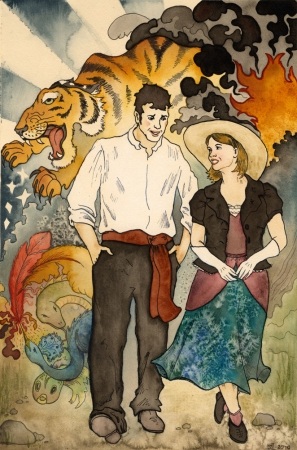
After visiting the Cardinal Stritch Northwestern Mutual Life Art Gallery, at first I did not think much about the exhibition by Sue Lawton (I've seen it for awhile because I work in the Art Gallery), but I also did not take much time to look at the works (I think at first I was not that interested because I am drawn to and used to looking at bigger works). After taking the time to view the series of illustrations from her exhibition The Circus and the Cyclone, I became very admirable of her work. I really love her work, not only for the technique but also for the story behind her series. The entire story is very well put together, and although the characters are fictional, the series presents a greater meaning - disasters reveal truths, no matter what situation. In Lawton's work, her technique and craftsmanship is amazing. Her line work is very precise and she works very well with the acrylics and water colors. I also think that the chosen hues presented in each individual piece all pull together very well. The overall style of some of the pieces reminds me slightly of the work of Alphonse Mucha - through the similar style of the French posters in a certain sense. In the piece above, I particularly like how the idea of normal vs. stereotype is presented or the idea of normal vs. abnormal (how circus characters are stereotyped). The action taking place and the conversation between the subjects seems normal, almost as if they are living normal lives for a split second, but then the eye is drawn to the whimsical background with the circus characters (tiger, creatures, circus-type decorations) - which reveals their stereotype of being circus subjects, entailing that they do not live normal lives. This idea also applies to the real world and how we stereotype other individuals and have a habit of calling individuals "abnormal", when really, what is normal and who really is normal?
Image derived from: Lawton, Sue. Lovers Walk. 2013. Illustration. Sue Lawton, Milwaukee, Wisconsin. Web. 22 Oct 2013. <http://www.suelawtonart.com/blog/galleries/the-circus-and-the-cyclone/>.
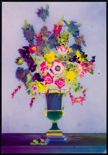
I really admire this piece for it's color usage. The piece itself is great, because it represents traditional vs. contemporary. The viewpoint of the subject matter is very traditional (face front type view), yet the color usage gives a twist to the piece. The colors within the flowers appear to be traditional at first, but then the eye moves towards the vase and the surface that the vase sits on top of, and it is apparent that the choice of hues are very non-traditional. I admire that there is a high contrast created between the objects/flowers, and each hue used for each object/flower is almost intense. The hues are off and are not pure, but are intensified through tinting and toning of those hues, which takes the idea of traditional photographs and using traditional colors and puts a twist to it - intensifying the hues and making the piece more contemporary. The piece has a slightly eccentric feel to it, but I really think the color usage is what makes this piece phenomenal. I also think the the hues and contrast really pull together well to create unity. For example, there are purple hues that appear on the surface that the vase sits on, the vase, and within certain flowers. This hue is then balance out by the yellow that appears throughout the vase and throughout the flowers again, etc. I also think that the feeling of unity is also created through the placement of the object within the piece, as well as the almost symmetrical yet a-symmetrical balance. Through the contrasted hues used within the flowers, the eye is drawn directly to those flowers and they really pop.
Image derived from: Steichen, Edward. Bouquet of Flowers. 1940. Dye transfer print.. Milwaukee Art Museum, Milwaukee, Wisconsin. Web. 21 Oct 2013. <http://mam.org/color-rush/>.
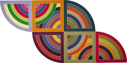
I really like this piece because it is very contemporary, yet a lot of the newer contemporary is non-geometric- so this is a great change from seeing that so much. This work is intriguing to me because it strays away from the contemporary abstraction that is commonly seen and it presents a structural vision in that same contemporary way. Although the piece itself is abstract (since there is no subject and it is all line work), the piece is very structured which challenges the tradition as of late. I like the piece because I think the color choices were very well thought out and the choices of color are interesting. The shapes all connect/are next to each other, which gives off a feeling of unity. There is also a high contrast between the sharp edges of the shapes and how the colors work against each other to create that geometric feel. To me, this piece conveys the idea of creating and maintaining structure in all different aspects of life in order to create unity within your life as a whole (the different shapes represent the different aspects of life, and the lines within those shapes are the implications within each aspect of life. This piece is very inspiring to me because it works against the traditions of new
Image derived from: Stella, Frank. Harran II. 1982. Polymer and fluorescent polymer paint on canvas. Guggenheim, Solomon R. Guggenheim Museum, New York, New York. Web. 17 Oct 2013. <http://www.guggenheim.org/new-york/collections/collection-online/artwork/4003>.
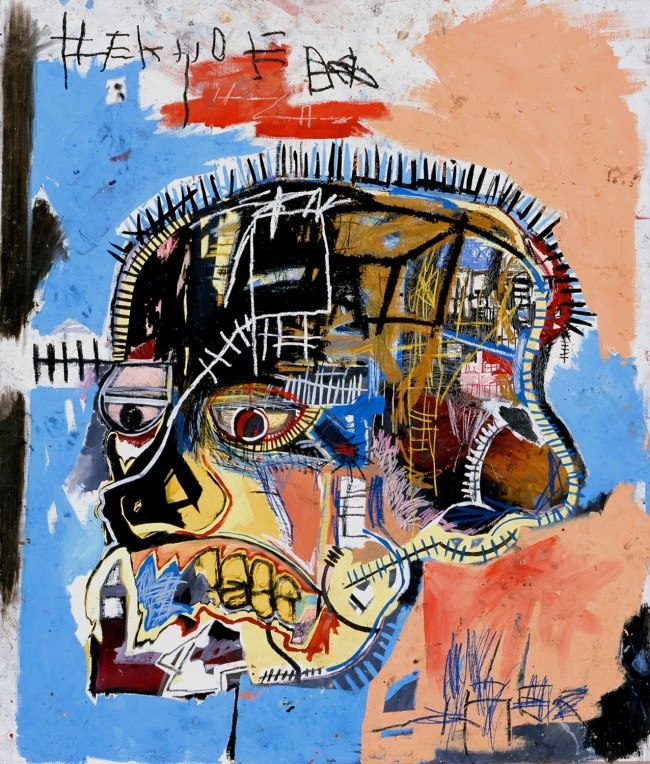
This piece is inspiring to me for the conceptual themes, as well as the modernistic style of the skull. When seeing skulls in art, they are typically seen as being very traditional-like, but this is very contemporary and modernistic. I love these piece not only for the color usage, but I love it for the idea that it is conveying the inner-workings of an individual, or how the mind works and how it is wired. I actually created a piece similar to this, so I am very inspired by this and I think this is an amazing piece. The high contrast between the colors and the different line weights within the inside of the skull conveys different sections of the mind and how those different sections are wired. I also am really drawn to the teeth. When I see the teeth, I think of a skeleton and the inner workings of an individual. I also think that the color choices for the background behind the subject (skull) is significant, because it conveys the idea that the subject is in the process of thinking or imagining (the colors are symbolic of an abyss of creativity/the mind working). I feel a lot of energy from this piece through the color usage, and this connects to the concept very well, because when your mind begins working and you become inspired and begin to imagine things, you feel energized an you begin to work to make your dreams, perceptions and ideas become a reality. I love this piece, and this will stay an inspiration for me for awhile.
Image derived from: Basquiat, Jean-Michel. Untitled (Skull head). 1984. Graffiti Art. Flux BostonWeb. 17 Oct 2013. <http://flux-boston.com/the-radiant-child-jean-michel-basquiat/>.
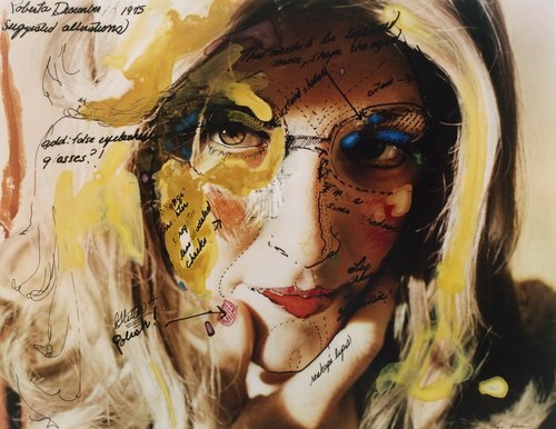
I really admire this piece because I think it i very powerful in the art world. This piece is probably one of the more interesting, because the artist actually underwent an alter ego for a few years to create this character. Roberta is a fictional character/alter ego created by Leeson who only existed for a certain period of time, and then was gone. Although her alter ego eventually disappeared, Roberta's existence could still be proven through documentation (driver's license, checking accounts, credit cards. The importance of the existence of this character was (for Leeson) the experience of Roberta, which determined her character. This piece itself illustrates the construction of Roberta and how her character was created. This piece is interesting to me, because in art, we all create fictional characters (through photography, portraiture, film, plays, etc) - but to actually create an alter ego and live another life enhances the entire experience. I also interpret this as being a social commentary on society and how we are always looking and striving to be someone else. For example, if an individual sees a celebrity that looks beautiful (such as Kim Kardashian), they say"Oh I wish I looked like her." This then turns into that individual starting to dress like Kim Kardashian, do their make-up like her, their hair like hers, etc. It is how our society is and how it has been for years. This piece draws attention to this and throws the idea in your face and makes you think about our society, why we are like t
Image derived from: Leeson Hershman, Lynn. Roberta’s Construction Chart #2. 1976. Photograph. The Modern Museum of Art, New York, New York. Web. 17 Oct 2013. <http://www.moma.org/visit/calendar/exhibitions/1355>.
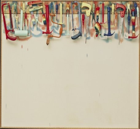
I am very drawn into the conceptual insightfulness of this piece and I think it conveys a lot of meaning. To me, the tools symbolize the idea of an artist having the ability to create anything that they desire. I also think this is powerful because the tools do not have to apply to just artists. Anyone has the ability to use tools (physically or more mentally) to change their lives and make an impact on the world in one way or another. I am drawn to the differentiation of hues used for the tools. The colors are significant in this piece, because they lie within the tools, and the piece is conveying the idea that creativity derives from your tools and how much use you make out of them. I also think it is significant to the concept that the tools are hanging higher up, because to me this conveys the idea of through using your tools to create new things, you can take yourself to higher place. I also think the white wall in the background is great, because it creates a needed emphasis on the tools. This piece is simplistic in a way, but I really enjoy and appreciate the concept behind this piece. I think this piece is very powerful, and I think the concept applies to anyone - no matter what they do.
Image derived from: Dine, Jim. Five Feet of Colorful Tools. 1962. Oil Painting. The Museum of Modern Art, New York, New York. Web. 17 Oct 2013. <http://www.moma.org/collection/browse_results.php?criteria=O:AD:E:1547&page_number=31&template_id=1&sort_order=1>.
|

 RSS Feed