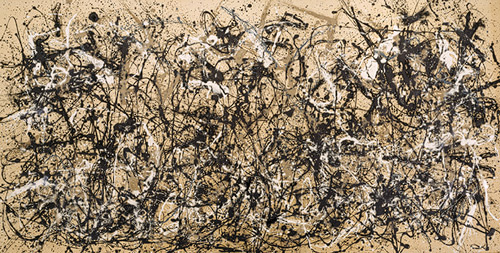
Although many people view Pollock's work as simplistic, I think it is very intricate and inspiring. Viewing the elements and principles of the piece, although the technique seems to be a bit random (throwing paint - you can't control where it lands). Although that is the case, Pollock really worked to control his color usage to create a sense of unity. There is also a color scheme (black, white, and grey), which also adds on to the sense of unity. I really admire the idea that there is a 3D-like texture that is created through the layering of the paint splatters. I also really admire the idea that Pollock created his work with emotion. In other words, the canvases convey what he was feeling at the moment he was actually creating the piece, and although it is very abstract, it is a great conceptual idea. I also really admire that there is balance created through the paint splatters, because with the technique, that seems to be a hard aspect to achieve.
Image derived from: Pollock, Jackson. Autumn Rhythym (Number 30). 1950. Painting. The Metropolitan Museum of Art, New York, New York. Web. 29 Sep 2013. <http://www.metmuseum.org/toah/works-of-art/57.92>.
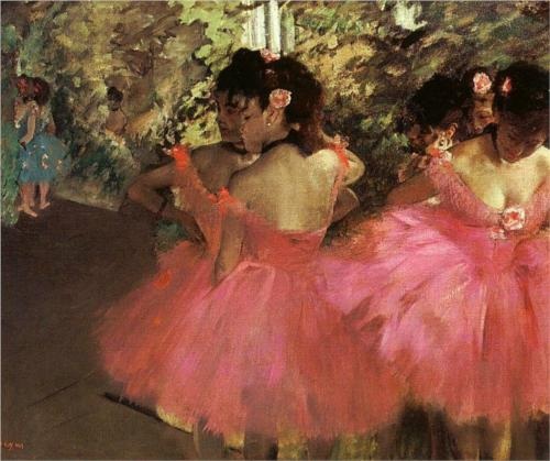
Edgar Degas is a major influence on me as an aspiring artist and I feel that his work is very intriguing through the perspectives that he presents. Any artist can paint a traditional portrait of a ballerina or ballerinas, but why would that be interesting? This piece captures the more "behind the scenes" perspective and reveals the modern life (at the time) for those ballerinas. The perspective creates an entirely new story on how ballerinas are viewed. When we view a ballerina in a traditional light, we see them as beautiful and almost as perfectionists for their ability to perform very well with such strength and form of the body. From this perspective, the struggle of the ballerina is revealed. The subject on the far right appears to be stretching or in pain, which is what viewers do NOT see in ballets or performances. We are only exposed to the beautiful artistry of dancing and movement. The subject on the farther left (who are closer together) both appear to be either tired, overwhelmed, stressed, or nervous about a performance. Again, this is something that the average viewer is not exposed to, and it gives viewers of Degas' piece an entirely new perspective on the ballerina and their life. It is not all fun and beauty, and there is a lot more work, effort, and time that goes into dancing than people think. I admire Degas' work, because it captures perspectives that we do not stop and look at in every day life. The perspectives he presents make you think differently, and I think that is very powerful.
Image derived from: Degas , Edgar. Dancers in Pink 1. 1880-1885. Painting. Edgar DegasWeb. 26 Sep 2013. <http://www.edgar-degas.org/Dancers-In-Pink---1.html>.
I connect to this piece a lot and I think the concept behind it has significant meaning to our culture and our society today. Before I go into the concept and my personal interpretation of this wonderful street art piece, I DO want to comment on the overall technique and color usage. I think it is interesting and very conceptual in regards to how Banksy decided to create harsh contrast between the subject and the sign that the subject is wearing, as well as how he created EMPHASIS on the sign through his choice of color usage. The subject itself and the fact that the subject is holding the suit case also plays a huge role in what this piece is conveying conceptually. When we think of a business man, we think of someone who is very busy and consistently has something to do. They always have places to be and people to see, therefore their social life begins to fall off because they are so busy with other things and achieving other goals related to business and work. The title of this piece and the sign correlate with the subject matter very well, and to me, the piece is commenting on society and how we have become so busy and wrapped up in the things that we do (work, and school mainly), that we do not have any time for social lives. There IS no interest in people, because it is very difficult for there TO be. This piece also reminds me of the 2008 Wall Street Crash and the economic recession in the United States and how many of these high bankers and CEO's of the banks and larger finance companies make billions of dollars, and they do not care about the greater good of OTHER people and other lives, they are more focused on the billions of dollars that they can make and what big buy they are going to spend their money on next. This may not even necessarily correlate to the 2008 Recession, but in general, there are many big CEO's of these corporations that makes millions of dollars - and even celebrities - and they REALLY have NO interest in people because they are keeping their billions of dollars for themselves and are not using it to help anyone or contribute in a positive way to the world. I really enjoy and admire this piece and I think it presents a fascinating concept that we all cou
Image derived from: Banksy, . 0% Interest in People. N.d. Graffiti Art. Flickr, Toronto, Canada. Web. 25 Sep 2013. <http://www.flickr.com/photos/martinreis/4595555984/sizes/z/in/set-72157624081319338/>.
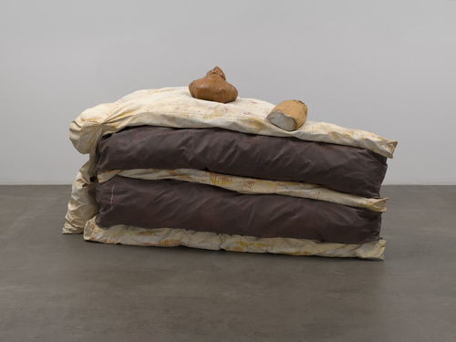
Oldenburg's work absolutely blows me away and I love and admire every aspect of his work and the concepts and subject matter that he presents. To me, this sculpture acts as a visual question to humanity and the things we value. Every day in our culture, we are surrounded by unhealthy, sugary foods that are constantly being pushed and shoved into our faces by advertising and the media. The fact that the cake is blown up into a larger size and presented this way is significant, because it emphasizes how this idea of not eating healthy has been lost and how we as a society have lost self-control. When we feel low or we don't not feel great about ourselves, many of us turn to food for comfort. I think the choice of medium is very significant, because the sculpture is soft. Just like the material used to create this piece, cake is very soft as well. The sculpture can easily be crushed and ruined, which is exactly what individuals potentially do to themselves if they make bad eating choices an everyday habit. Although this piece was created BEFORE the idea of obesity and indulging became more of an issue, it could represent the start of the issue or when it first started becoming more apparent in society, which I think is very interesting.
Image derived from: Oldernburg, Claes. Floor Cake. 1962. Sculpture. The Metropolitan Museum of Art, New York, New York. Web. 24 Sep 2013. <http://www.moma.org/collection/browse_results.php?criteria=O:AD:E:4397&page_number=20&template_id=1&sort_order=1>.
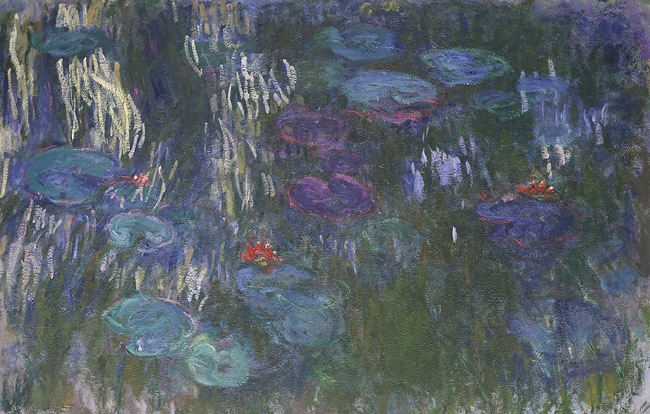
I really admire this piece for its abstraction and curiosity that draws me to it. In other words, Although the piece is entitled "Water Lillies" which gives away the subject matter and what it really is, that is not necessarily recognizable at first. The colors seem to be shifted a bit and it appears that the water lilies are actually blue and the body of water is green. I show a lot of gratitude towards this piece for the concept of it being very whimsical and quick. It is abstract in the sense that the shapes are not easily recognizable and viewers have to kind of ponder upon the subject matter to get a sense of what is being portrayed. The whimsical and white lines create a movement that guide the eye around the piece. I also really think that the technique and concept flow together, and that it was intentional, which I also really admire. In other words, the technique is very naturalistic and free-flowing - while nature is also a natural element of the earth. I admire this piece mainly because the important aspect of the technique of impressionism is not the subject matter and how it appears or how much it portrays what Monet was ACTUALLY painting, but it is about portraying how the artist felt at that point in time when they were creating the work, so it conveys a lot of deep emotions that can help pull viewers in and connect them to the piece, which I think is a phenomenal concept and a great technique in art that should be appreciated or more appreciated. Another aspect of this piece is that although the colors are cool and calmer, the technique is almost the opposite (in some areas of the piece the line strokes are very scratchy), which goes back to the idea of impressionism and how Monet felt while creating this work.
Image derived from:Monet, Claude. Water Lilies. 1926. Oil on canvas. The Metropolitan Museum of Art, New York, New York. Web. 23 Sep 2013. <http://www.metmuseum.org/toah/works-of-art/1983.532>.
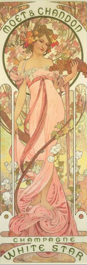 I have always really admired Mucha for his work, especially his colour lithographs and posters that he created for advertisement. This piece in particular draws me in. I love his soft use of colors, yet the feel of the subject is still realistic. I also really admire the decorative designing with the flowers and the use of line (the branches) that he uses. The use of line in this piece really plays a crucial role. For example, the lines created in the ribbon on the subject's dress, along with the branch that starts from the bottom of the piece and almost wraps around the subject, when viewing the piece, that is the first thing I see, and my eye follows those subjects up to the face, where I am then drawn to the text and the beautiful decorative flowerings at the top of the poster. The piece itself APPEARS to be simplistic (through lack of shading), appears to be flat in a sense, yet it is intricate through the decorative details and the detailing of the subject. The contrast of the wording from the decorative designing it also very significant to the poster. The fact that the words are presented in white banners allows them to contrast from the colors that are behind them, which makes the words stand out, which is the point of the poster is to get people's attention and draw them into the advertisement (that's what Mucha created these posters for...he collaborated with other individuals to create things such as posters, postcards, catalouges, and other promotional material for companies/brands.
Image derived from:Mucha, Alphonse. Poster for 'Moët & Chandon: Champagne White Star'. 1899. Colour Lithograph. Alphonse MuchaWeb. 20 Sep 2013. <http://www.muchafoundation.org/gallery/browse-works/object/53>.
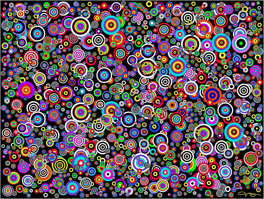
I am very admirable of this digital composition for it's complexity and color usage. I usually am not admirable of works that show a lot of repetition, but this piece is different. In the piece, I really like how there is a variety of sizes of the circles, and I like the wide color differentiation and usage. I also like how the circles overlap each other, making the shapes appear to be more 3-Dimensional in a 2-Dimensional way. I also feel that this composition relates to our current Circle, Square, Triangle piece through the idea of working with a simple shape (the circle) and turning it into a well thought out and complex design. The piece itself is very intriguing through it's layering of the shapes, line weights, contrast created through the harsh lines, as well as the feel of unity that is created through repetition of the shape, as well as all of the other elements that were previously mentioned that pull the composition together. There is also clearly a feel of balance that is created through the positioning and repetition of the circles. Through the harsh lines and the dark black background, the eye is guided through the piece and follows those harsh lines and colors, allowing the viewer of the work to become absorbed into the abstract abyss of circles.I really love the piece for the creativity created through the
Image derived from:Gray, Bruce . Spots #7. Digital Composition. Web. 20 Sep 2013. < http://www.brucegray.com/htmlfolder/html_subpages/Spots7.html>
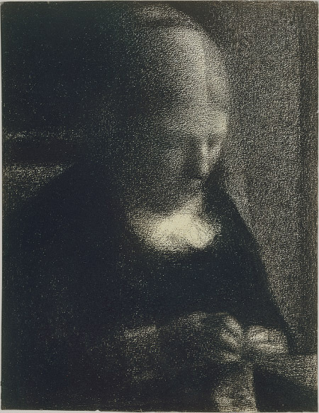
To me, Seurat's work is one of a kind and his use of texture really sets his work apart from other artists. For example, in the piece above, Seurat does not create a texture with the crayon, but rather, works with the texture of the paper to create an abstract/distorted type feel to the portrait. To me, this piece represents the concept of concentration. Although the subject is Seurat's mother, the focus does not necessarily seem to be on the IDEA that the subject is his mother, but rather the action she is portraying (silent concentration). The piece is more focused on the action of his mother through the distortion and lack of detail in the face. This is significant to the modern world, because it is portraying the idea that (from a modern stance) we have lost the concept of concentration and silence through technology, music, social media, and the idea of consistently having to do things. There is no time to sit down in silence and relax. The usage of the crayon and black and white tones also conveys this, because when we think of black and white, we think of darkness or things fading away (color fading to black). The piece presents the idea that humanity has technologically evolved to such a powerful extent, that there no longer is time for quiet concentration to do things that you enjoy (in the piece, the subject is/seems to be knitting - a hobby of some sort). This brings up the question of How did this happen? What can we change? How can we change our mindsets? Where do the limits start and end?
Image derived from:Seurat, Georges. The Artist's Mother. 1882-83. Conté crayon on paper. The Metropolitan Museum of Art, New York, New York. Web. 18 Sep 2013. <http://www.metmuseum.org/toah/works-of-art/55.21.1>.
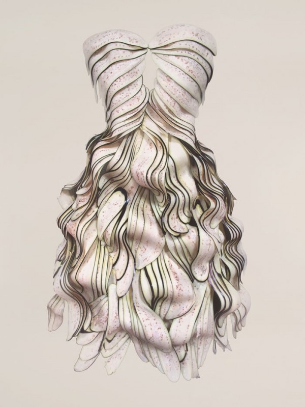
Having studied Yeonju Sung's work a bit in high school and using her as inspiration, I admire her sculptural dresses not only for the uniqueness to them, but for the structure and medium choice. I love that she chooses to work with and use food to create these objects, because eventually the sculpture's die and decay away/rot (food does not last forever). In her artist statement, one of the most interesting things that she states is when she writes "The food medium I have chosen for clothes are not protective enough for our body, or durable. Also, it is unmanageable to the passing of time and is easily affected by surroundings. An original function of clothes as a protector for skin is totally destroyed since my clothes are made with food." (Sung) This concept reminds me of the idea that as humans, we can sometimes be easily influenced by our surroundings, and at times, we become so influenced, we morph and change to fit the mold of our surroundings that are influencing us. The fact that the clothes are not protective enough for the body is also significant, because it implies how vulnerable we are as humans, and how easily influenced we can be. I also really admire her pieces for the sculptural intricacy. The dresses are very detailed and almost look very flashy in a sense - if they were real, wearable, dresses, they look as if they would/could possibly be of a more expensive brand, which could also imply that humanity is easily influenced by materialism, and it changes us as individual beings and changes our perspectives.
Image derived from:Sung, Yeonju. Eggplant Dress. N.d. Sculpture. Tree LandWeb. 16 Sep 2013. <http://trendland.com/wearable-foods-by-sung-yeonju/>.
Quote/information derived from: Sung, Yeonju. "Artist Statement." Yeonju Sung. n. page. Web. 18 Sep. 2013. <http://yeonju.me/index.php?/sung-yeon-ju/about-this-site/>.
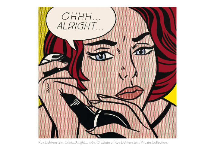
I really admire Lichtenstein for not only his pop art style, but for the idea that his work conveys emotions in a cartoon-type way that everyone can relate to. I also admire his work for it's precision. The work itself it hand-made (not computer generated), so it amazes me how computer-like his work is (even in person, I've seen his piece entitled Crying Girl at the Milwaukee Art Museum, and the precision he uses in the dots he use for the skin of the characters to give his pieces a "comical feel" is fascinating... almost as if there is a mathematical skill behind the technique. This piece I admire a lot, because it conveys an emotion that we all deal with in daily life. We are all told things that we do not want to hear, and we simply just have to take those things in, process them, and learn/decide on the right way to respond/deal with that. I feel that this is what that piece is conveying (my own interpretation), and I think that the expression of the character also adds on to that. This piece almost relates to our Circle, Square, Triangle project in the sense of paying close attention to line weights, color usage, precision, etc. Lichtenstein is a legend, and I have been inspired by his work for a while now, and will always continue to be inspired by it.
Image derived from: Lichtenstein, Roy. Oh...Alright.... 1964. Photograph. The Art Institute of Chicago, Chicago, Illinois. Web. 16 Sep 2013. <http://www.artic.edu/aic/collections/exhibitions/Lichtenstein>.
|

 RSS Feed